Zine Research and Examples
Nine Weeks - Ines Ferreria
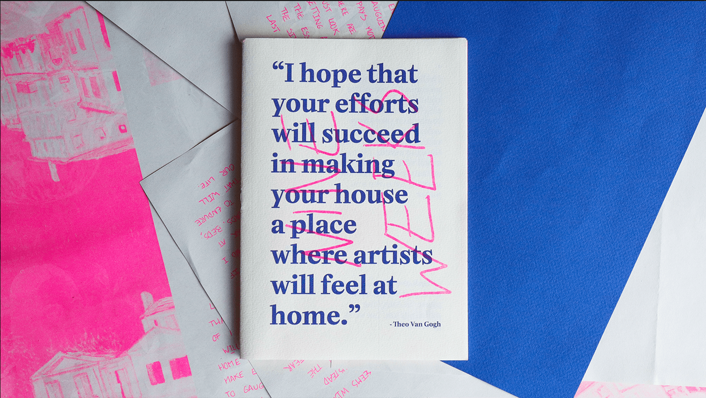
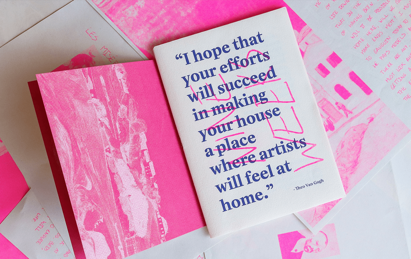
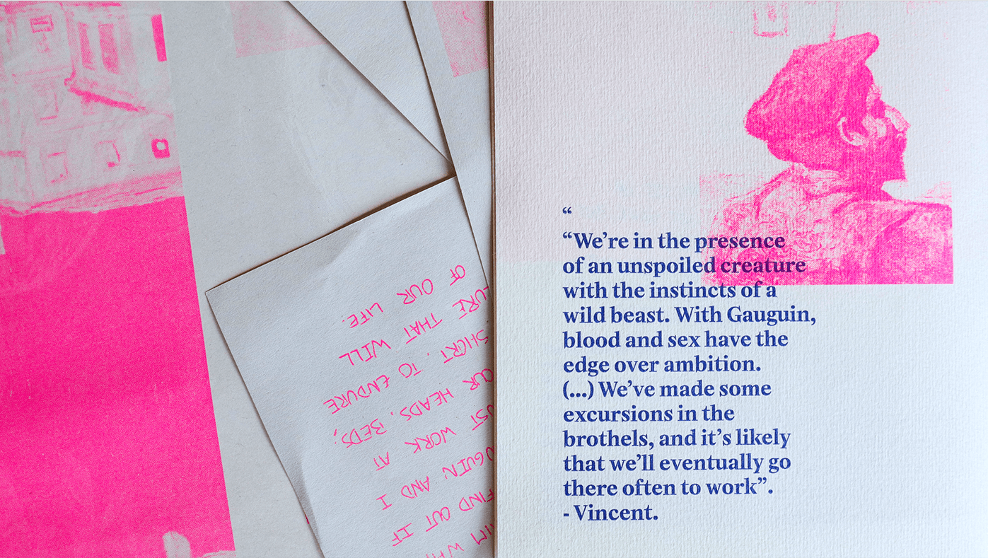
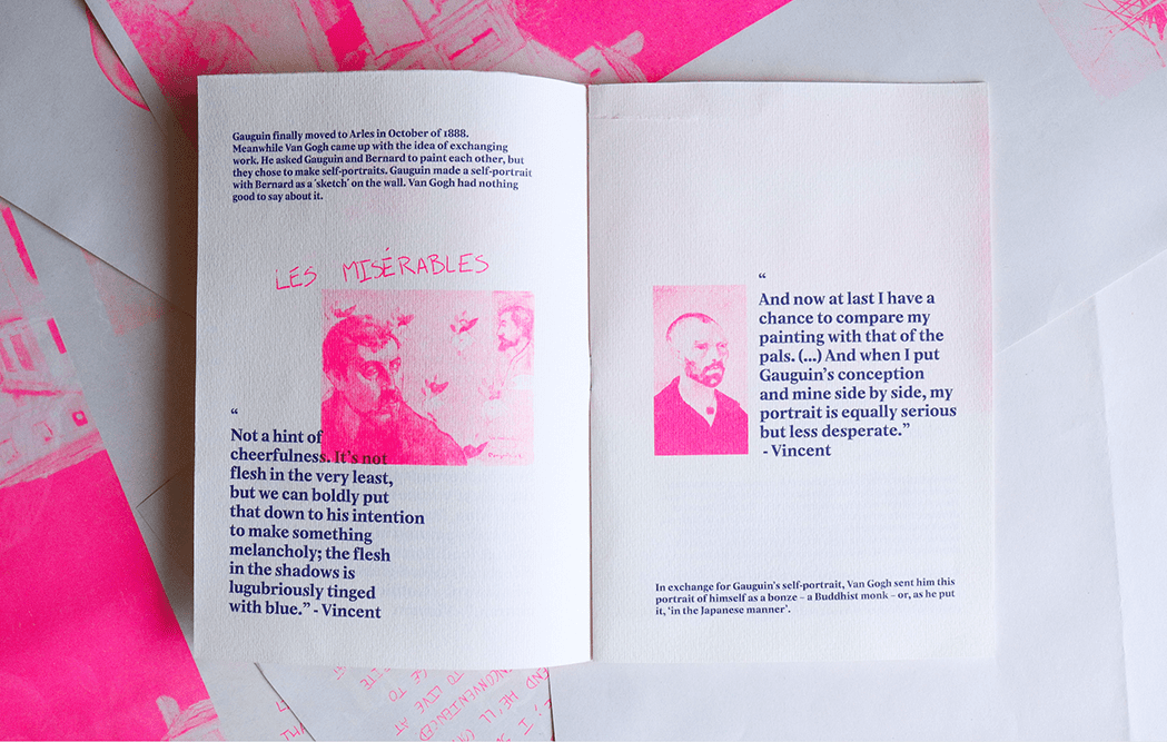
This zine called 'Nine Weeks' produced by Ines Ferreria uses a collection of quotes and photography. Firstly, the most striking thing is how saturated the images are. The zine sticks to a colour scheme of fluorescent pink and blue. The colours work in contrast to each other, the blue acting as the main typographic colour as the vibrant pink is the hue of the images. The main typographic element focuses on quotes from Van Gogh, using a serif typeface. This typeface is well suited for the subject matter, the serif typeface encapsulating the traditionalist, aged aesthetic. This works in contrast to the hand-drawn typeface written for the title and subheading (as seen in Les Miserables). This thinly weighted script typeface of the titles contrasts the more heavily weight serif typeface quotes. All the serif text is left aligned, making the quote easier to read and align better with the rectangular images. I personally like the colour scheme of this zine, the saturated pink creating a focal point. It also isn't what is typically expected. I like the combination of the typefaces too, the serif contrasted with the script typeface adds personality to the otherwise, formal text.
I'm so f***ing tired of Helvetica - Andrea Bianchi
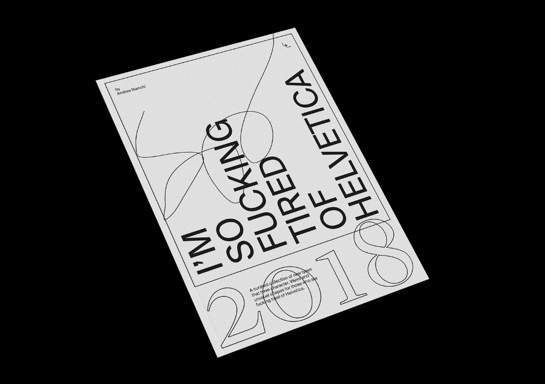
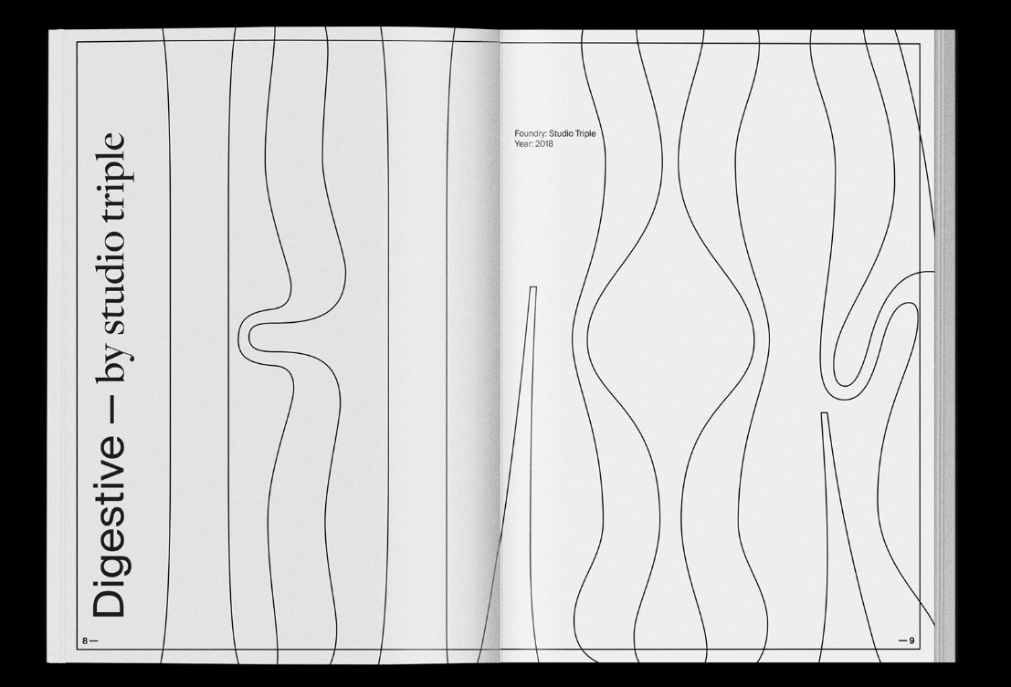
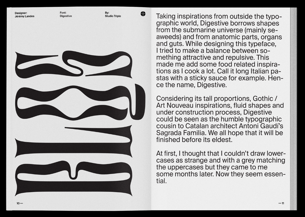
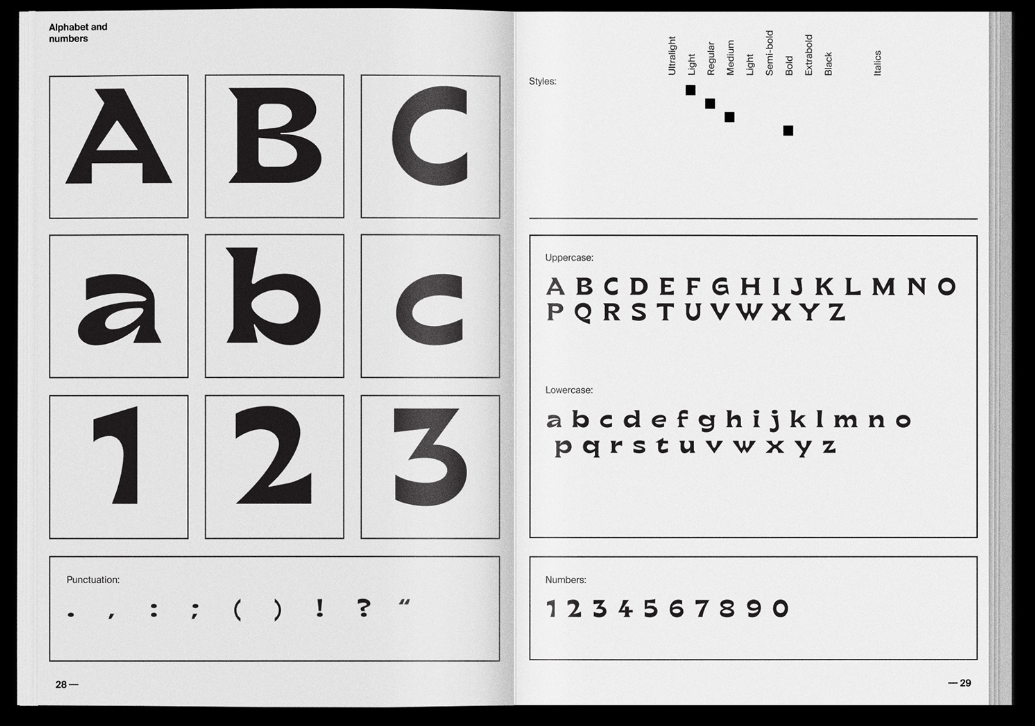
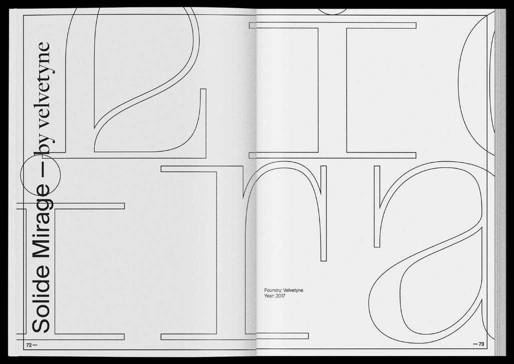
'I'm so f***ing done with Helvetica' is a zine designed by Andrea Bianchi. Firstly, the zine sticks to a simple black and white colour scheme. It utilises this minimalist colour by experimenting with line. As seen through some of its pages, the letter outlines are used to create points of interest. I find this greatly fascinating, manipulating the letters themselves to create illusions and illustrations. The layout of this zine is also quite simple. It focuses on the look of the spread over individual pages. The grid seems to be separated into 3 columns as seen in the header text. This compliments the very minimal nature of the zine. However, by incorporating interesting letter shapes, ways of displaying information (such as the alphabet image) and multitude of typefaces, it makes for a very effective and captivating zine. I would like to incorporate its simplistic aesthetic into my own zine. I will take inspiration of the contrasting yet effective colour scheme, grid structure and theme.
Don't Just Do It - Luke Maitland
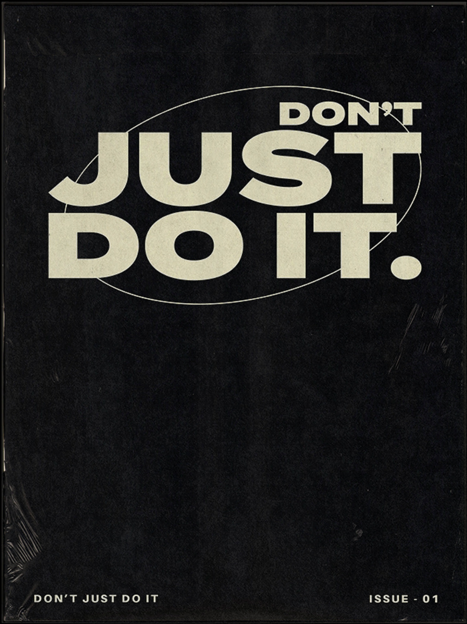
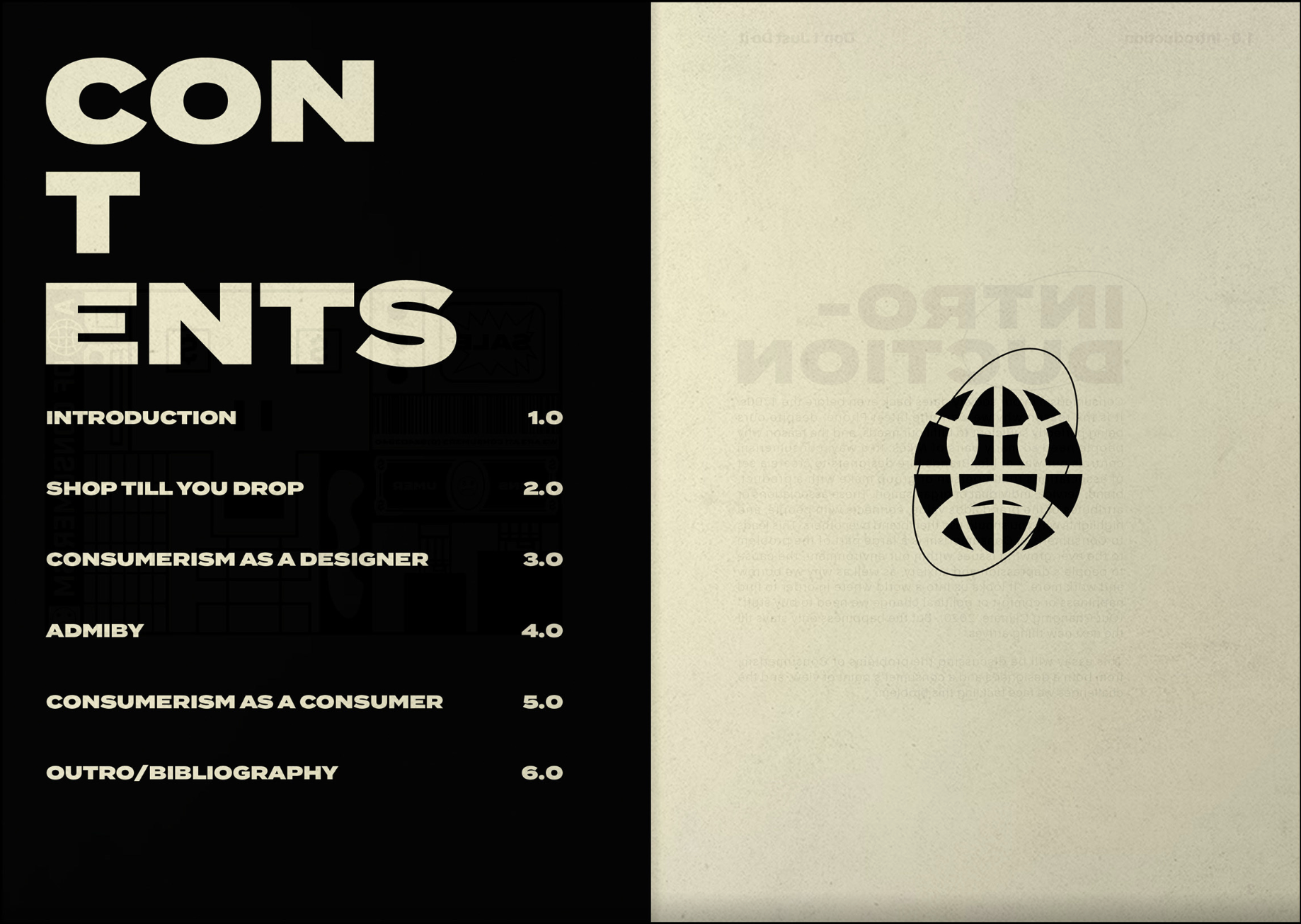
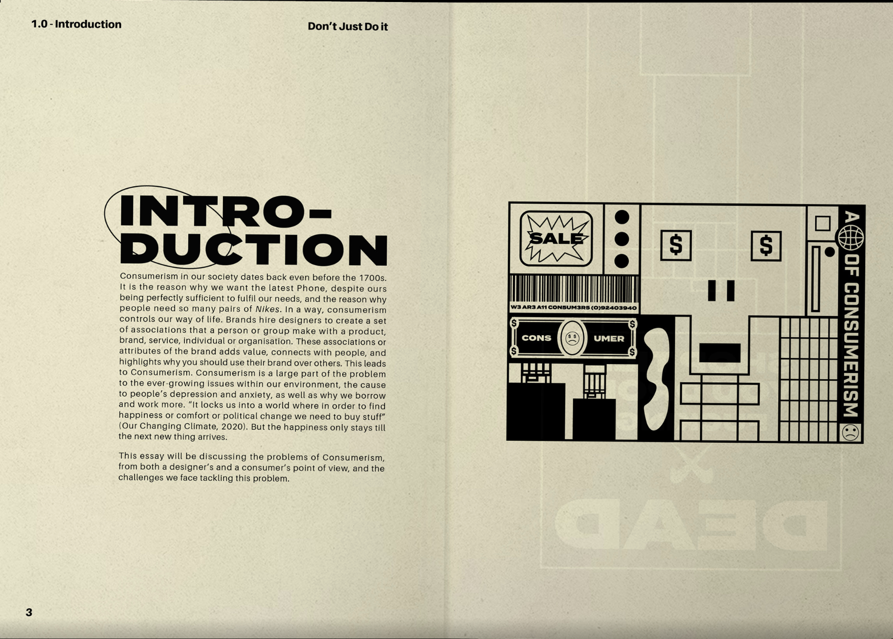
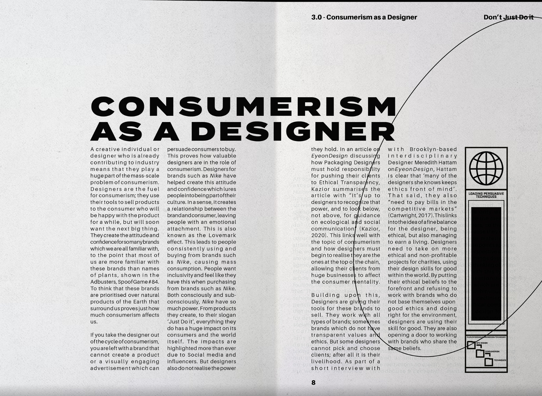
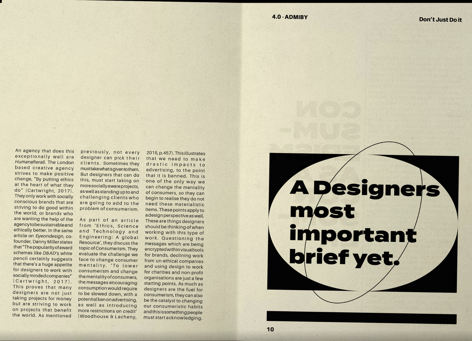
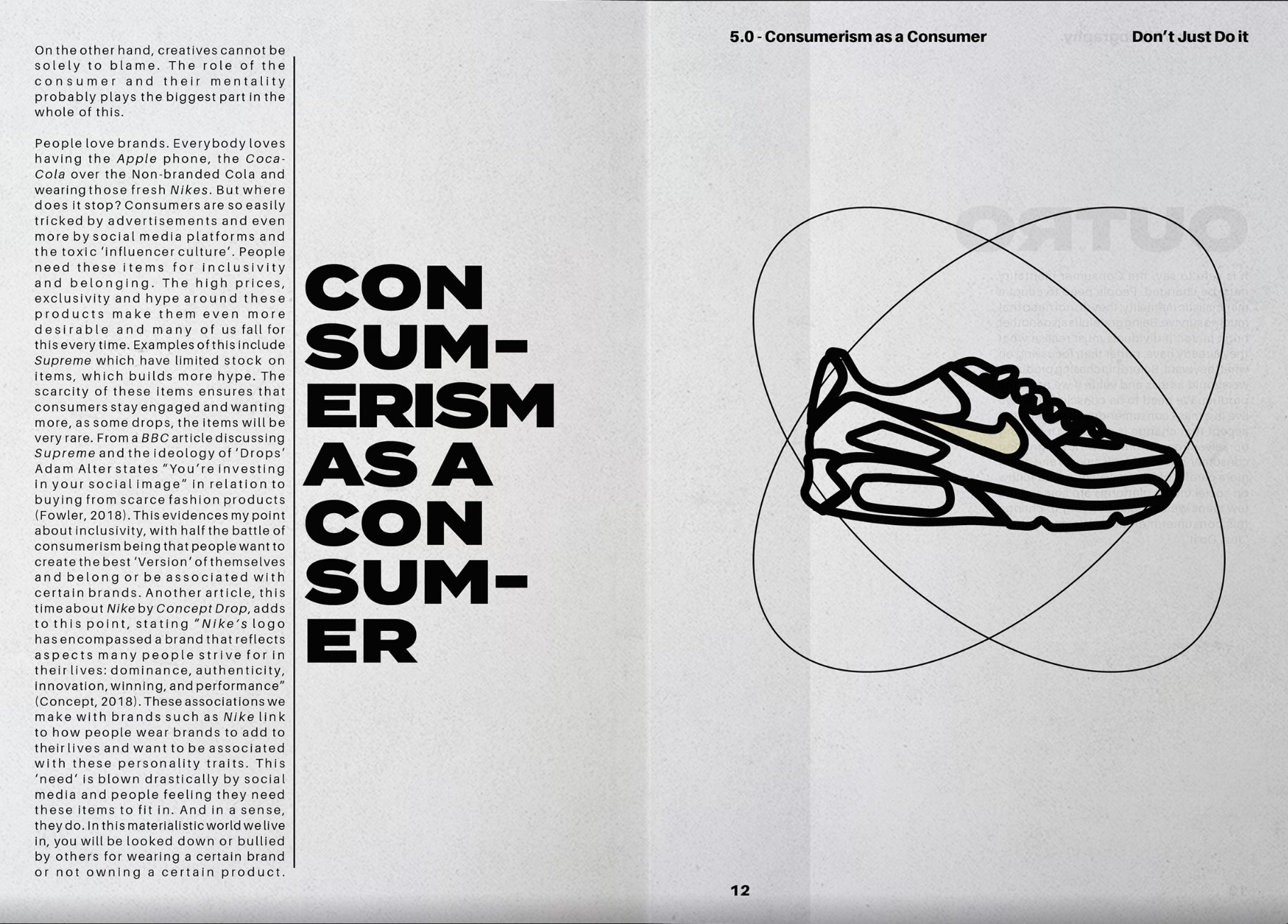
'Just Don't Do It' by Luke Maitland uses space and grid structures very effectively. The typeface and colour scheme are quite minimal, the colours sticking to black and white with some pages appearing in a tinted beige colour. It seems that there is only one typeface. This sans-serif typeface uses different fonts to differentiate the type hierarchy. The title appears to have a black font, being more heavily weighted. This dominates more space, attracting the eye to this. The bodycopy is at a smaller scale and lighter weight. However, it doesn't contrast the title like the other examples. The sans-serif bodycopy works effectively to compliment the title. The choice of sans-serif makes the zine feel more modern and contemporary. The grid structure seems to switch between multi-column with three columns or a column in the middle of the page. The simple grid structure allows for a simplistic and minimal page layout, where information is easily communicated. I love how the negative space is used to successfully display the page's information. It doesn't make the page look too sparse but there is another space to let the text breathe.
Zine Concept and Thumbnails
Typefaces Designed for Visual Impairments
For the zine, the topic will be about typefaces designed for disabilities and impairments. Ranging from dyslexia, colourblindness and the spectrum of blindness, there are many ways to alter a typeface to better help legibility and readability. The creative direction I want to tackle relies on differentiation and contrast, allowing people who experience these to be able to comprehend written text. The page structures will follow a very minimal and spacious format with a very clear type hierarchy. This will help convey the message more effectively and sticking to being able to differentiate information. The zine will explore typefaces that comply to and help communicate text effectively, how these typefaces differentiate letters to accomodate for the specific impairment and how it can be applied universally.
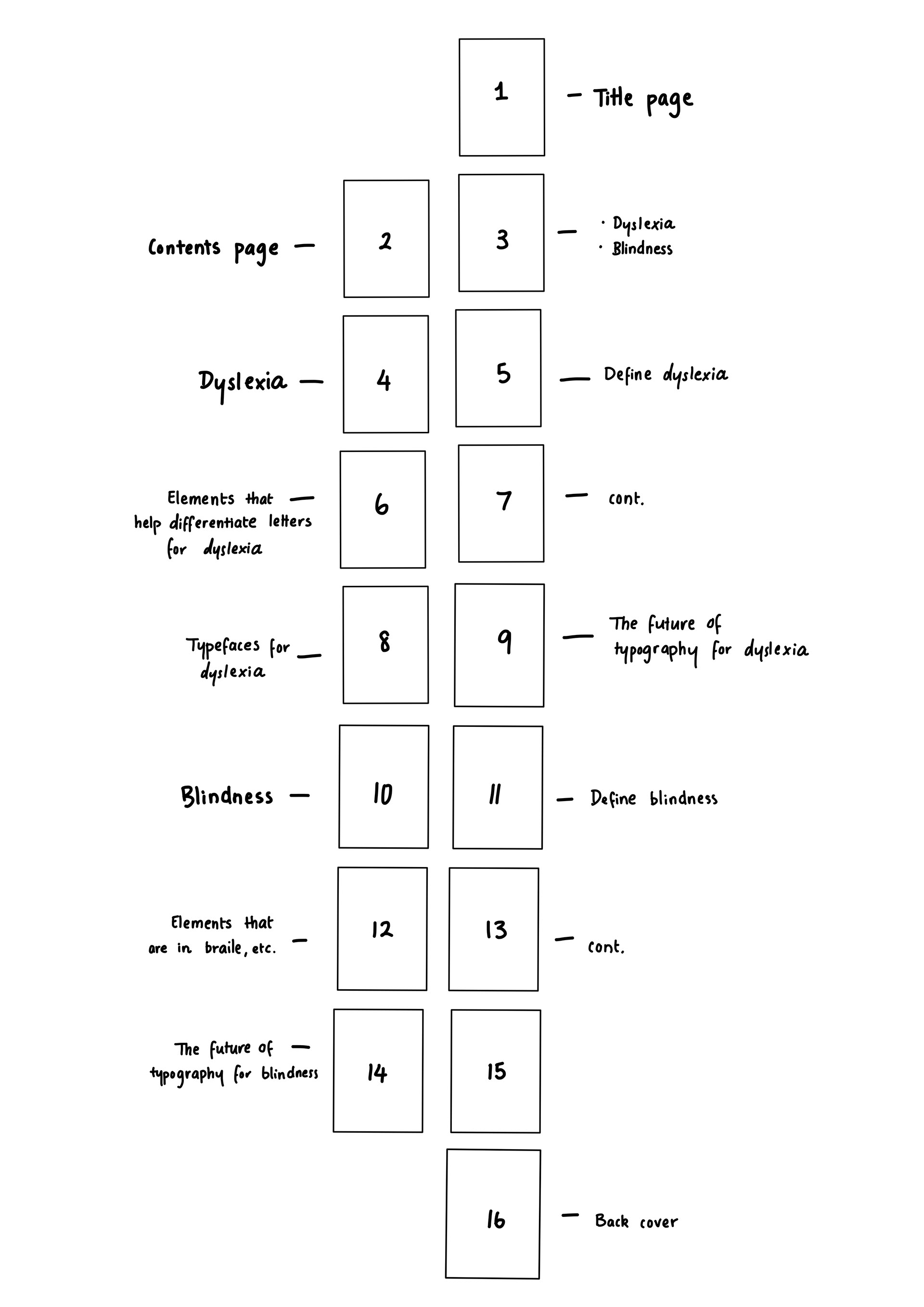
The idea for the zine is to split the content up into two sections: one section discussing dyslexia and the other discussing blindness. This would make the zine easy to navigate, allow for a contents page with descriptors and provide enough information for the 16 pages. Each topic has 6 pages, sectioning them off into definition, typographic elements, typefaces and its future. The blindness category is missing a typeface section as it would be quite limited, however, it'll use the double page spread to discuss its future implications. This section will also be using theory provided in the history of typography lecture.
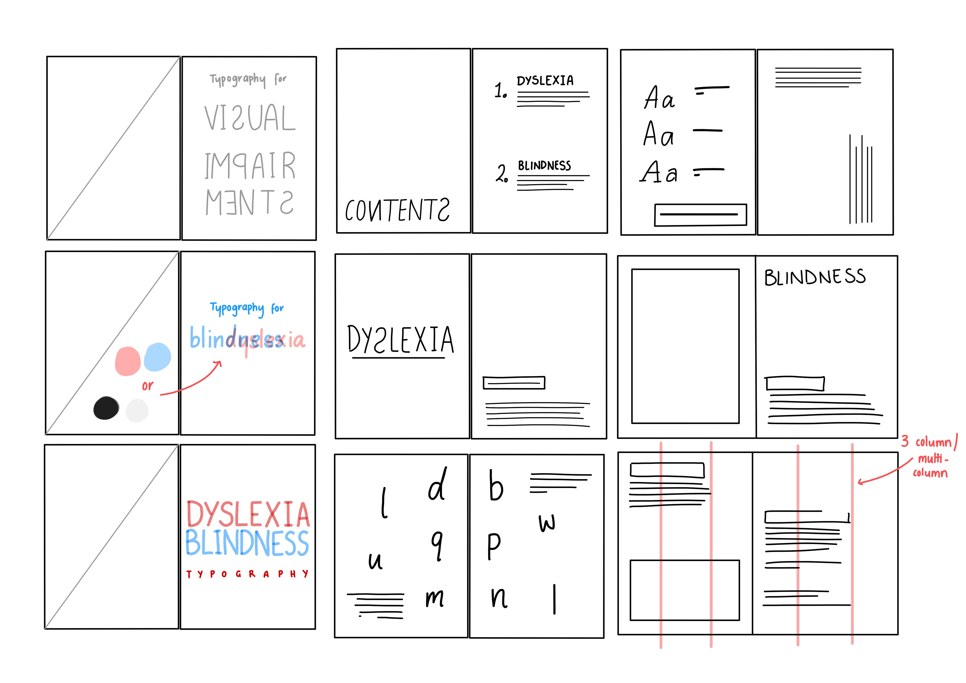
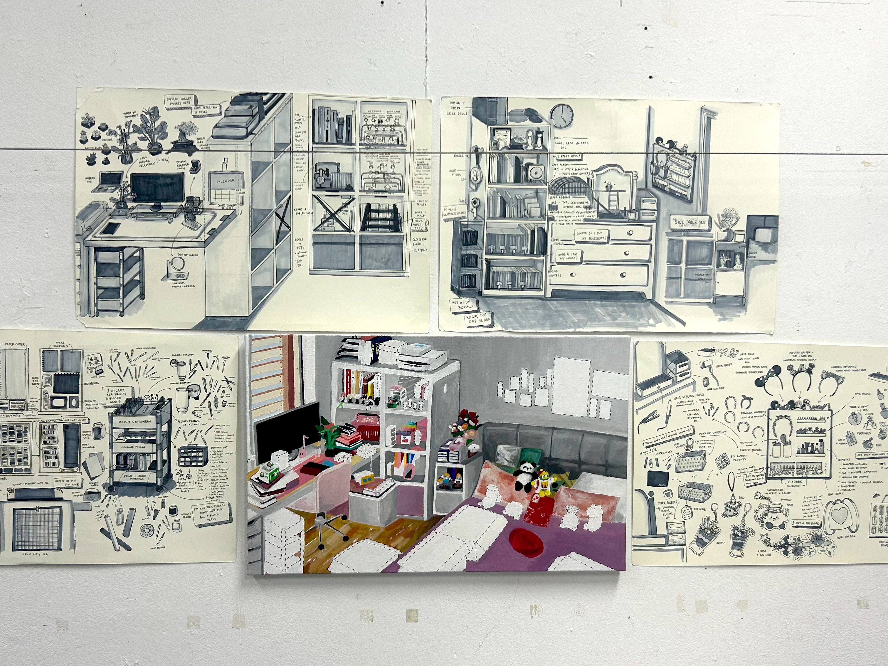
The thumbnail ideas centre around the idea of space and the use of the grid. The first column of thumbnail sketches are ideas for the title page. Because of the limited colour palette, I found it difficult to use it effectively. When researched, red and green were asked to be avoided when it came to reading disabilities because of colour-blindness, however, this made for an interesting blending effect. Another implication I could add was intentionally distorting text, such as reflecting it or make it appear in the uncanny valley (have it appear readable but it isn't spelt correctly or missing something). This would make for a visually consistent element.
I wanted to keep the grid structure relatively simple. Sticking with a 3 column (multi-column) grid will create interesting layouts, as well as easy to read ones. By separating the page into thirds, the information can be spaced in a number of ways and could compliment the type hierarchy. The number of cells also helps structure a 'Z' rule reading format that can help the reader's eye navigate pages smoothly.
After receiving feedback, the direction and content on the page was further explored. The purpose of the zine is to be educational. The zine will provide information as to what is optimal and display the braille alphabet. This will help guide the direction of the zine, helping establish design choices for a certain audience.
References
Bianchi, A. (2018). I’m so f***ing tired of Helvetica [Photpgraph]. Behance. https://www.behance.net/gallery/69634027/Im-so-fing-tired-of-Helvetica-Editorial?tracking_source=search_projects%7Czine
Ferreria, I. (2021). Nine Weeks [Photograph]. Behance. https://www.behance.net/gallery/127359803/Booklet-Nine-Weeks
Maitland, L. (2021). Just Don’t Do It [Photograph]. Behance. https://www.behance.net/gallery/114036127/Dont-Just-Do-It-Zine?tracking_source=search_projects%7Cjust%20don%27t%20do%20it
