Unpicking the Grid
Queensland Theatre - The 2019 Season
What typefaces were used? How do they relate to the function/message?
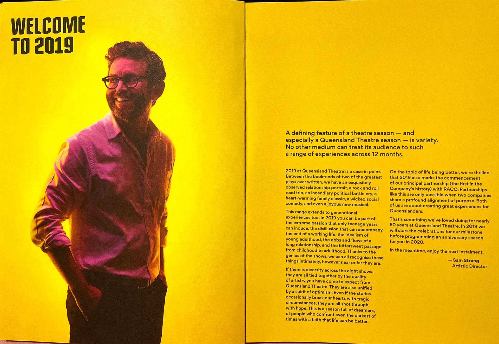
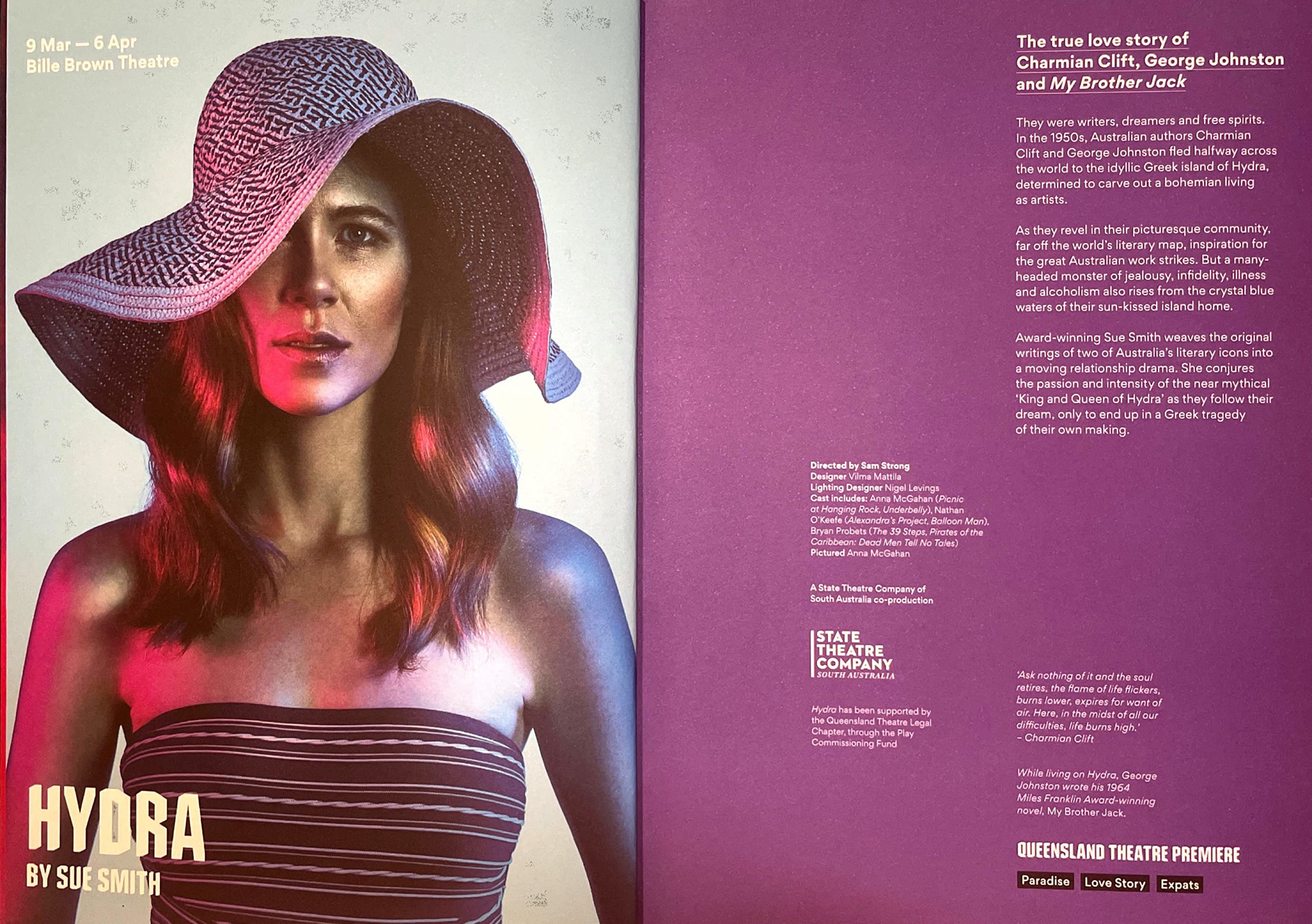
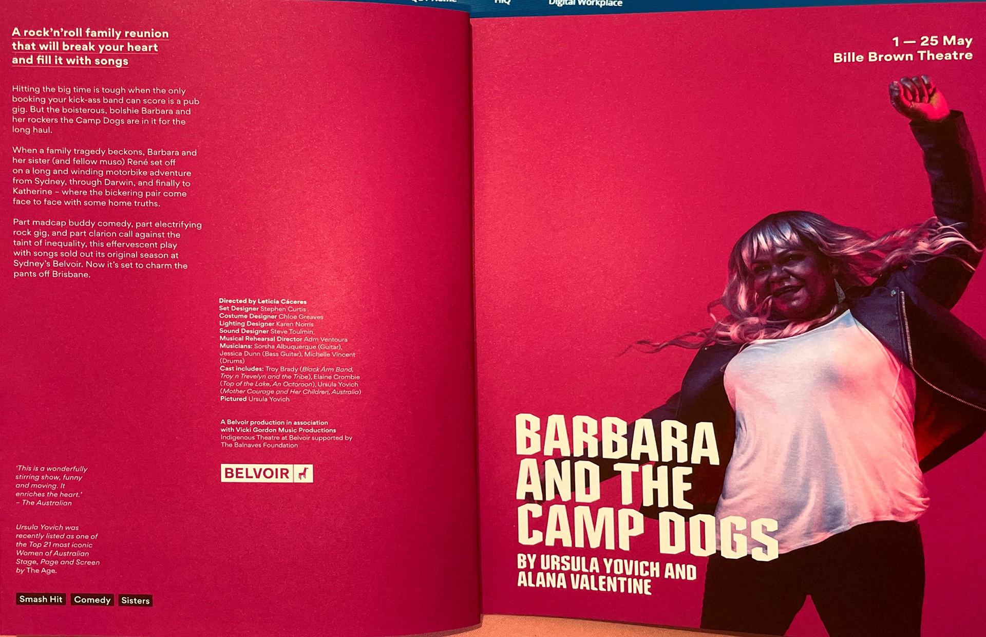
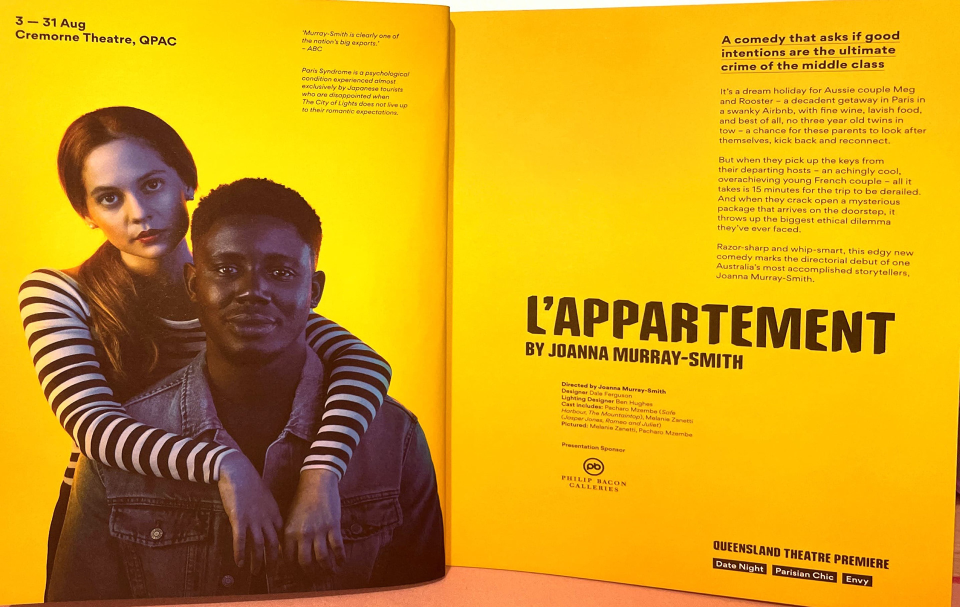
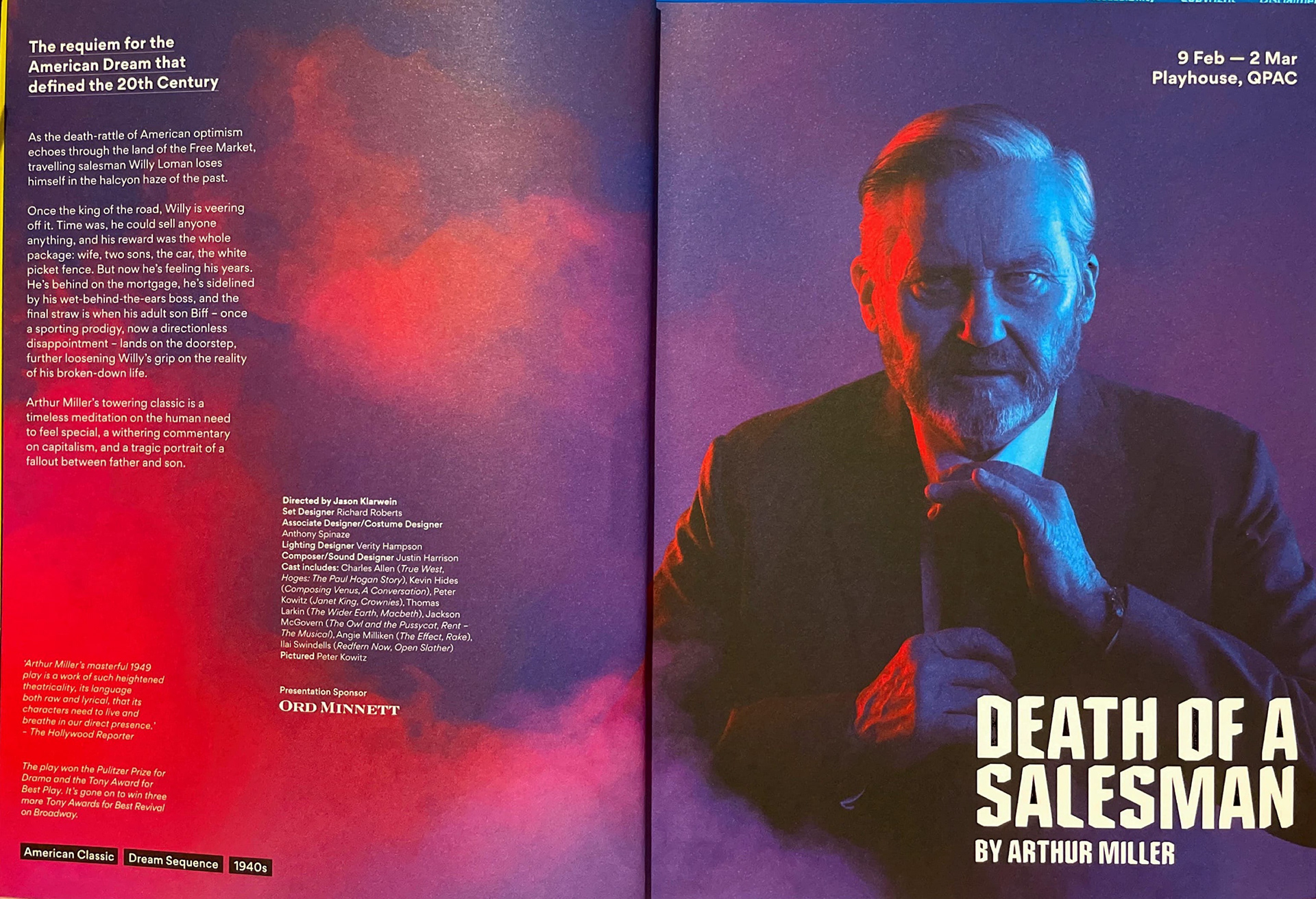
The 2019 Season Programme for the Queensland Theatre used two main typefaces. The title and byline has its own typeface; a heavy weight, sans-serif typeface. It looks similar to slab serif typefaces, however, it is notably missing the serifs. The letter forms appear geometric in the sense that it has linear edges. The typical curves within the counter and shoulder are shown to be more rigid in the R and B. It appears to look octagonal because of this. The functionality of this title typeface is used to contrast the bodycopy typeface. Compared to the more circular, grotesque bodycopy, the title typeface is bold and attention grabbing.It is used as the title of booklet itself, as well as the titles for all the programs. The second typeface is used for the theatrical dates, standfirst and bodycopy. This is a grotesque typeface, seen by the horizontally linear apex of the A. This typeface uses a multitude of fonts, being seen in bold, regular and italic. The functionality of using different fonts allows for an easier distinction of type hierarchy and emphasis on specific information.
What is the hierarchical structure and what were the markers used?
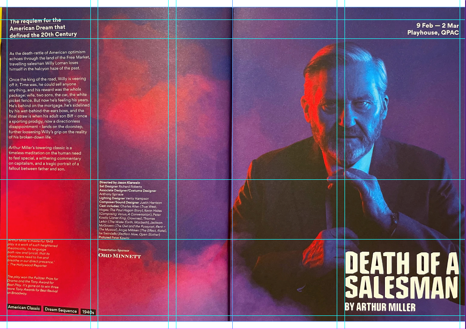
As previously stated, the hierarchy is first established by the title, based on its unique, capitalised typeface. Secondly, it is followed by the stage play's author (byline) which is situated underneath the main title in the same, slab like typeface. The eye then travels to the performance dates and standfirst, placed on the top left and right corners of the spread. They use a bolded, scaled up rendition of the bodycopy typeface. The performance dates are always situated on the corner of the image's page, to indicate that it is important information. Then, the byline in particular uses an underline, differentiating itself from the main bodycopy. Underneath the byline, the main three paragraph long bodycopy is positioned, using a regular font. The production's credits are scaled down, bolding their role. Finally, quotes from reviewers and achievements are italicised, followed by rectangular boxes filled with words associated with the production.
What kind of grid was used (single-column, multi-column, modular, baseline, other) and what elements determined the grid structure?
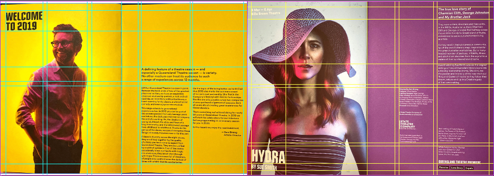
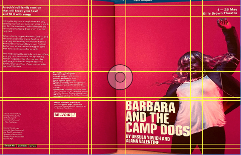
The grid format uses a multicolumn grid for its primary grid structure. The image (of the actor/s) takes up one page, usually following a centre page symmetry. The title follows either this symmetry (fitting within a two column grid) or a three-column grid. The three column grid is used in the standfirst and bodycopy text, situating itself in the column furthest away from the gutter. The second column has the production roles in place, occupying the central column. Finally, for the reviewer's quotes, it is then again, positioned in the bodycopy column. The gutter occupies as the third column.
How do you think the design works overall? What could be improved?
The design works cohesively, each page sharing commonalities to create an easy to read and navigate booklet. However, elements such as the title have to show variety in order to keep the book interesting. They attempted to do this by sometimes positioning the title in the middle of the page, on the opposite page of the image. This breaks continuity and makes the hierarchy harder to navigate. This is seen in the L'Appartment page, where the title is situated in the middle of the bodycopy page. It confuses the reader by not knowing where to go after reading the main title. Positioning the title on the top or bottom row of the page would help create a more nuanced and fluid reading experience.
Picking a Grid
The Student Budget
Final Booklet

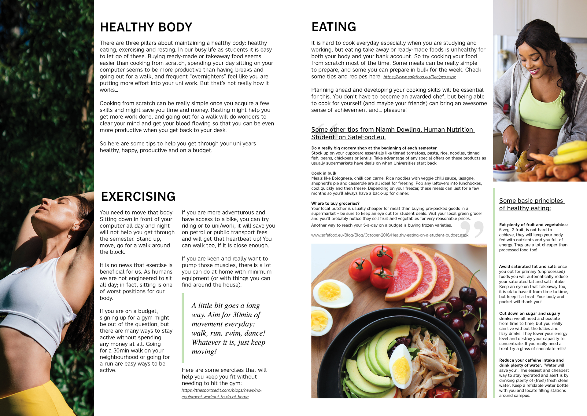
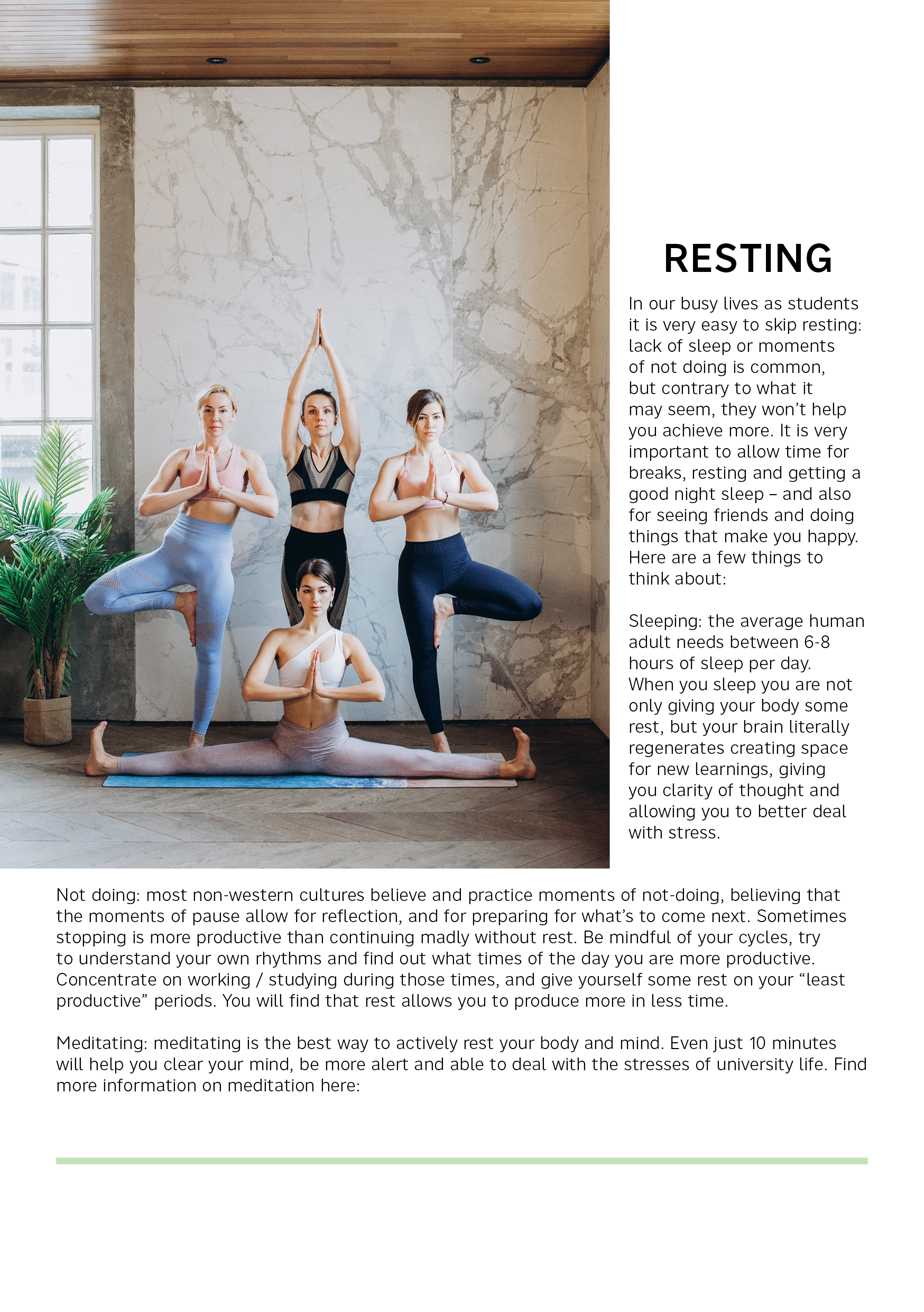
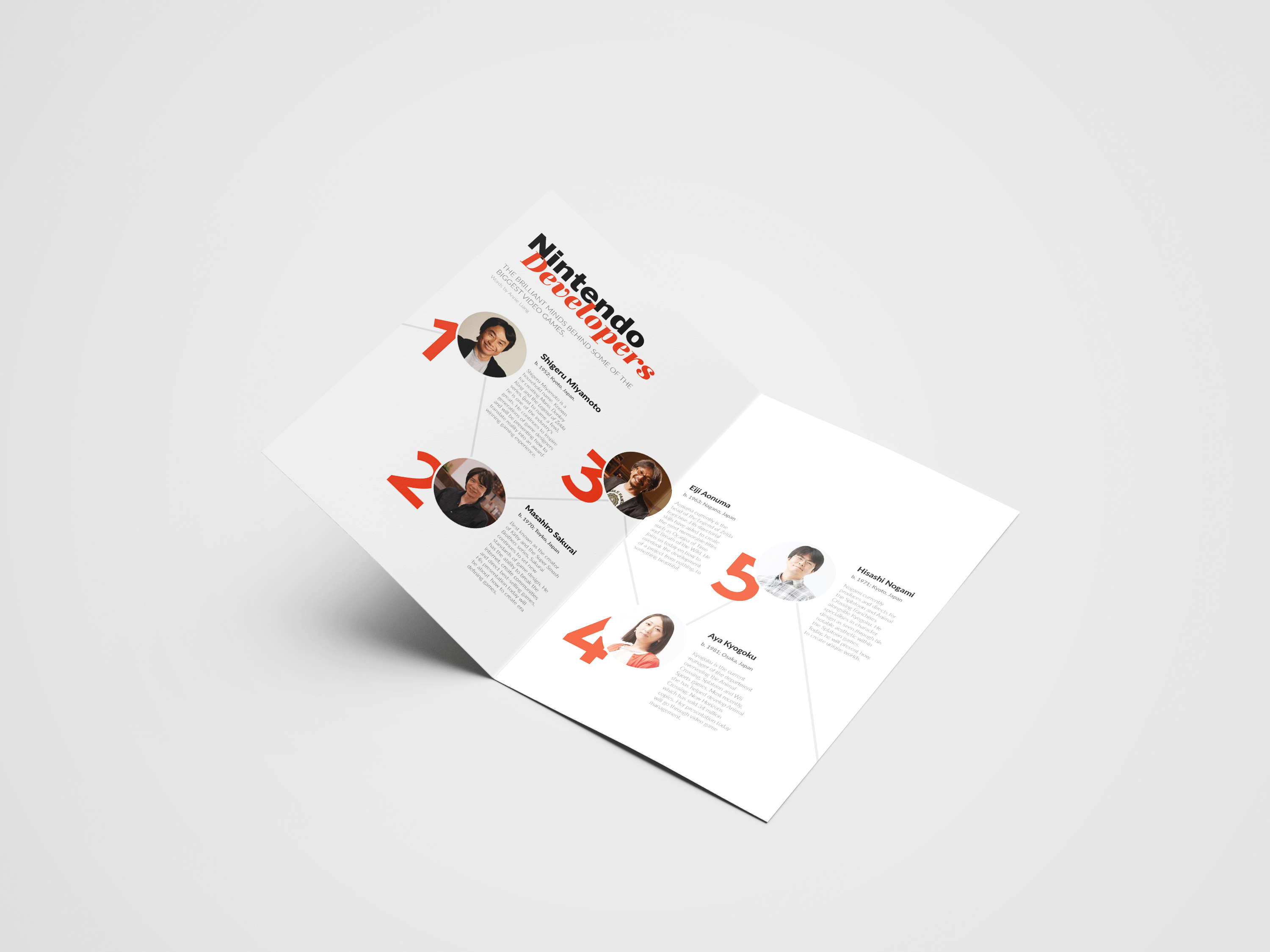
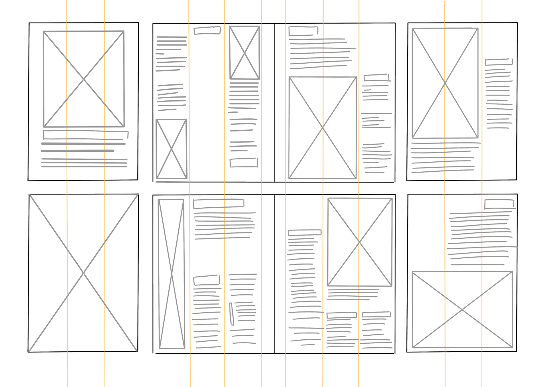
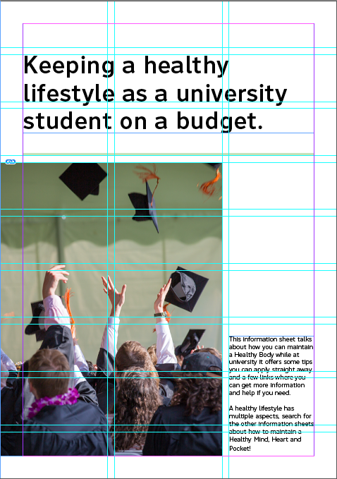
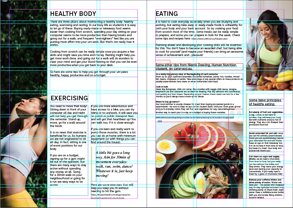
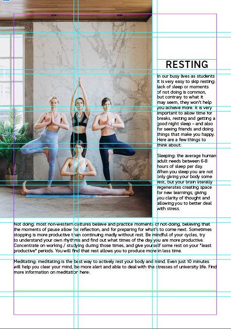
The final booklet encapsulates all the information on a half-folded A4 page. The information is sequenced so it is read left to right for easy reading. Because of the amount of information needed to be delivered on the page, a modular grid structure was chosen. A modular grid is ideal for extremely complex projects that require a lot of information. The matrix of cells divide the information into smaller chunks and by combining cells, there are spatial zones. These spatial zones allow for areas to show relationships and connections. By choosing a modular grid structure, there is more flexibility in how information is displayed. But if there are too many cells, it can become confusing and redundant (Samara, 2017). The modular grid I decided upon is a 3x9 grid. Because of the size of the page, it's best to stick to a smaller size. This would be to avoid cramming too much information. The rows of cells help divide the necessary information into smaller section, making it a lot easier to read and gloss over.
References
Crowley, N. (2017). Woman Slicing Gourd [Photograph]. Pexel. https://www.pexels.com/photo/woman-slicing-gourd-1153369/
Doan, T. (2017). Variety of food on wooden coaster [Photograph]. Pexel. https://www.pexels.com/photo/variety-of-food-on-wooden-coaster-793759/
Fairytale, E. (2020). Group of women practicing yoga [Photograph]. Pexel. https://www.pexels.com/photo/group-of-women-practicing-yoga-3822724/
mockupguy2. (n.d.). A5 a6 folded brochure card mockup Free Psd [Mock up]. Freepik. https://www.freepik.com/free-psd/a5-a6-folded-brochure-card-mockup_13012296.htm#query=booklet%20mockup&position=45&from_view=keyword
Ranquist, E. (2018). Photography of people graduating [Photograph]. Pexels. https://www.pexels.com/photo/photography-of-people-graduating-1205651/
RF._.studio. (2020). Woman in white sports bra and yellow leggings stretching [Photograph]. Pexel. https://www.pexels.com/photo/woman-in-white-sports-bra-and-yellow-leggings-stretching-3820441/
Samara, T. (2017). Making and breaking the grid, second edition, updated and expanded : A graphic design layout workshop. Quarto Publishing Group USA. 20-42

