Project Outline
"We Are Louder Than..." is a campaign targeting micro-aggressions towards women, in the workplace. This issue resonates with me personally as a woman who desires a brighter and safer future. Especially in a professional environment, everyone deserves the right to be treated respectfully and fairly. The goal of my campaign is to help people speak up against these sorts of micro-aggressions. It would be beneficial to also educate on how these micro-aggressions may occur and their consequences. Additionally, representation of both men and women are important in this campaign to demonstrate. This topic requires everyone to take a stand and to discourage this form of discrimination.
Research
Social Issue
The social issue this campaign is tackling is sexism towards women. More specifically, sexism towards women in the workplace. This issue will be mainly focusing on micro-aggressions against female employees. Micro-aggressions are defined as offensive comments or actions made towards a marginalised group which are subtly communicated. These comments or actions are intended to reinforce stereotypes or be derogatory (Washington E et al., 2020). Many times, they are made ignorantly so it is important to speak up, discourage and educate others when it happens. Examples of these sorts of micro-aggressions can be...
- Insisting women prove their qualifications and underestimating work ethic.
- Designating tasks to women that are usually targeted towards female stereotypes (planning, organising, etc.)
- Using derogatory terms when addressing women.
- The act of mansplaining (men re-explaining or claiming ideas brought up by women).
The list goes on and on... (OurWatch, n.d.)
64% of women in the workplace experience everyday micro-aggressions in the workplace. Especially women of colour or those in the LGBT+ community, are more likely to experience discrimination through micro-aggressions (Lean In, 2018).
Figure 1: The percentage of categorised employees experiencing micro-aggressions within the workplace (Lean In, 2018).
These workplace micro-aggressions can be seen throughout all areas of society. For example, a 1997 report conducted by Grauerholz and King analysed 48 hours of prime time television shows. They found that 84% of shows had at least one incident of sexual harassment. They were mostly described as micro-aggressions, using sexist terms, comments on women's bodies or physically leering towards women ad girls. It's important to also note that none of these incidents were labeled as sexual harassment but instead, used humorously (Galdi S et al., 2014).
It's important to shine a light on these issues because it is so deeply rooted in society. This type of sexism appears very passively, intended to reinforce discrimination in a subtle manner. This sort of sexism isn't just found in the workplace, but throughout all areas and used in many different forms. It can be verbal or physical. It's important that everyone take a stand and react appropriately (whether it speak up or physically disapprove) when it occurs.
Similar Campaigns
Our Watch has a campaign called, Doing Nothing Does Harm. This campaign discusses and brings awareness to the micro aggressions against women. Their campaign centres upon the hero archetype, being brave and feeling accomplished when standing up against prejudice. It also typically takes the every-man archetype to communicate that anyone can do this. OurWatch inspired this campaign greatly in how it communicates sexism and how to speak up against it.
The Say Again? campaign issued by Komatsu Australia is also partaking in stopping everyday sexism in the workplace. It asks that employees respond to inappropriate behaviour by asking, "say again?" This in turn, questions the person's intention without being confrontational. This is a part of their everyONE counts campaign, ushering inclusion and diversity throughout the company (Komatsu Australia, 2019).
Catalyst launched a campaign called #BiasCorrect which addresses subconscious gender bias. This bias discusses how women are treated differently when exhibiting masculine traits. This bias is said to translate terms such as strategic and confident to more negative traits such as calculated and aggressive. This bias also influences behaviour, job advancement and the gender pay gap. This campaign allowed a greater insight as to why women don't speak up against sexist behaviours in the workplace. It additionally demonstrates micro-aggressions through shifting bias and how even particular words can have a different meaning (Catalyst, n.d.).
Mood Board Inspiration
This mood board encapsulates the strong, powerful messages of my campaign. Many of the images use a minimal or flat design art style. It captures the feminist messages symbolically; all the hands in together and the ladder achieving success. The colours revolve around vibrant purples and additional warm colours (red, pink, yellow) to target a feminine audience. These colours are also used to communicate power with their vibrancy.
Figure 2: Mood board for campaign
Planning
Storyboard
Using a parallel narrative to interweave different perspectives of the situation. The idea of the story is to show the nuances of the situation and the different ways it can viewed by those around it. Because it requires everyone to speak up, it will need to incorporate a female and male perspective. The target demographic will be younger women and men (around the ages of 18-25) as they are newly entering the workplace.
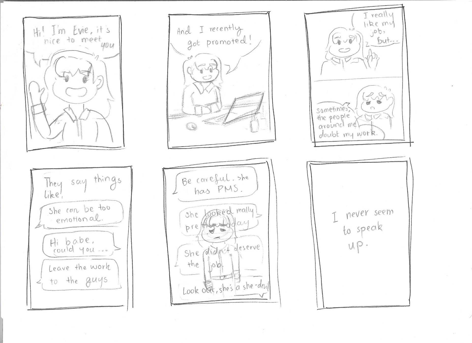
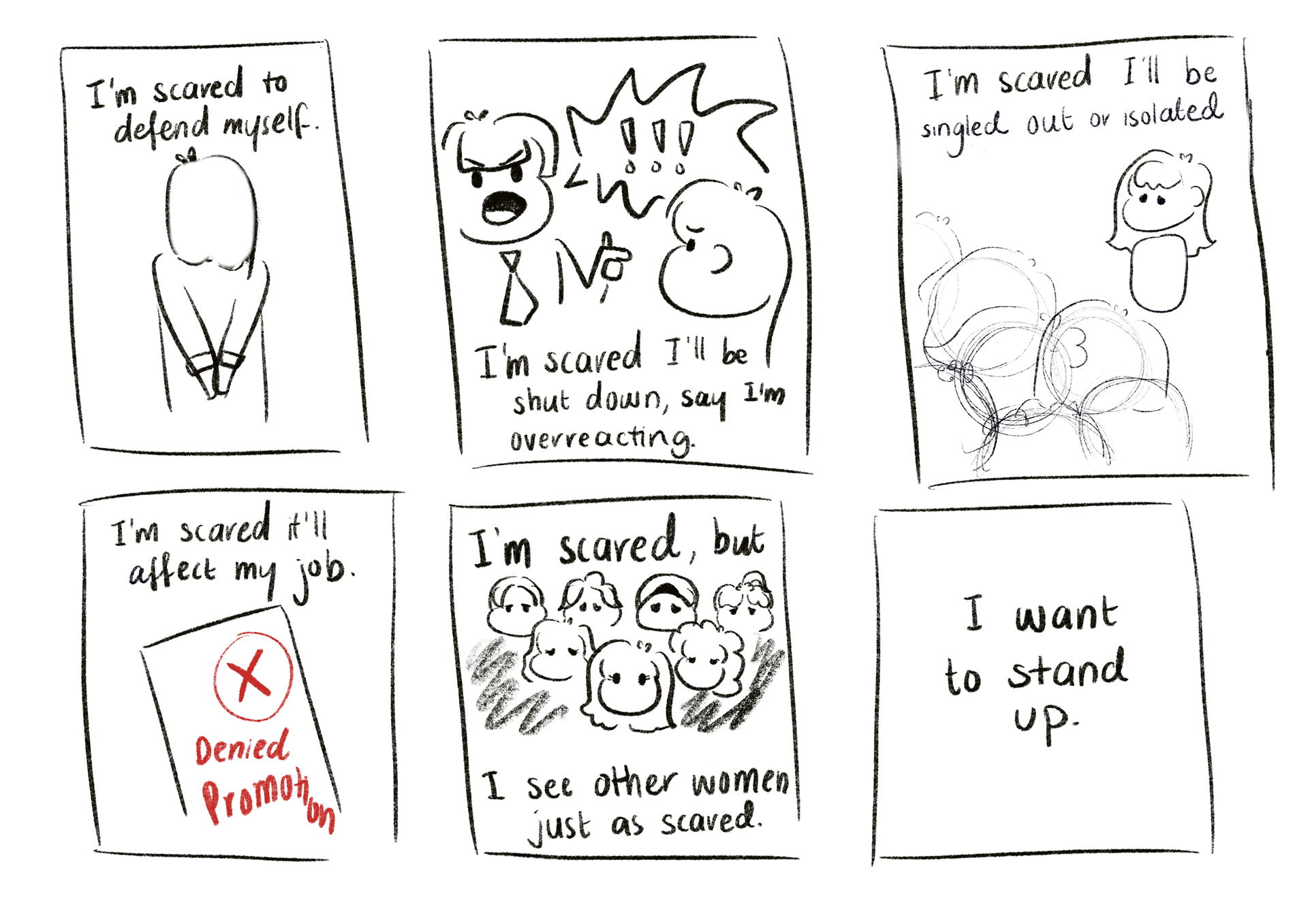
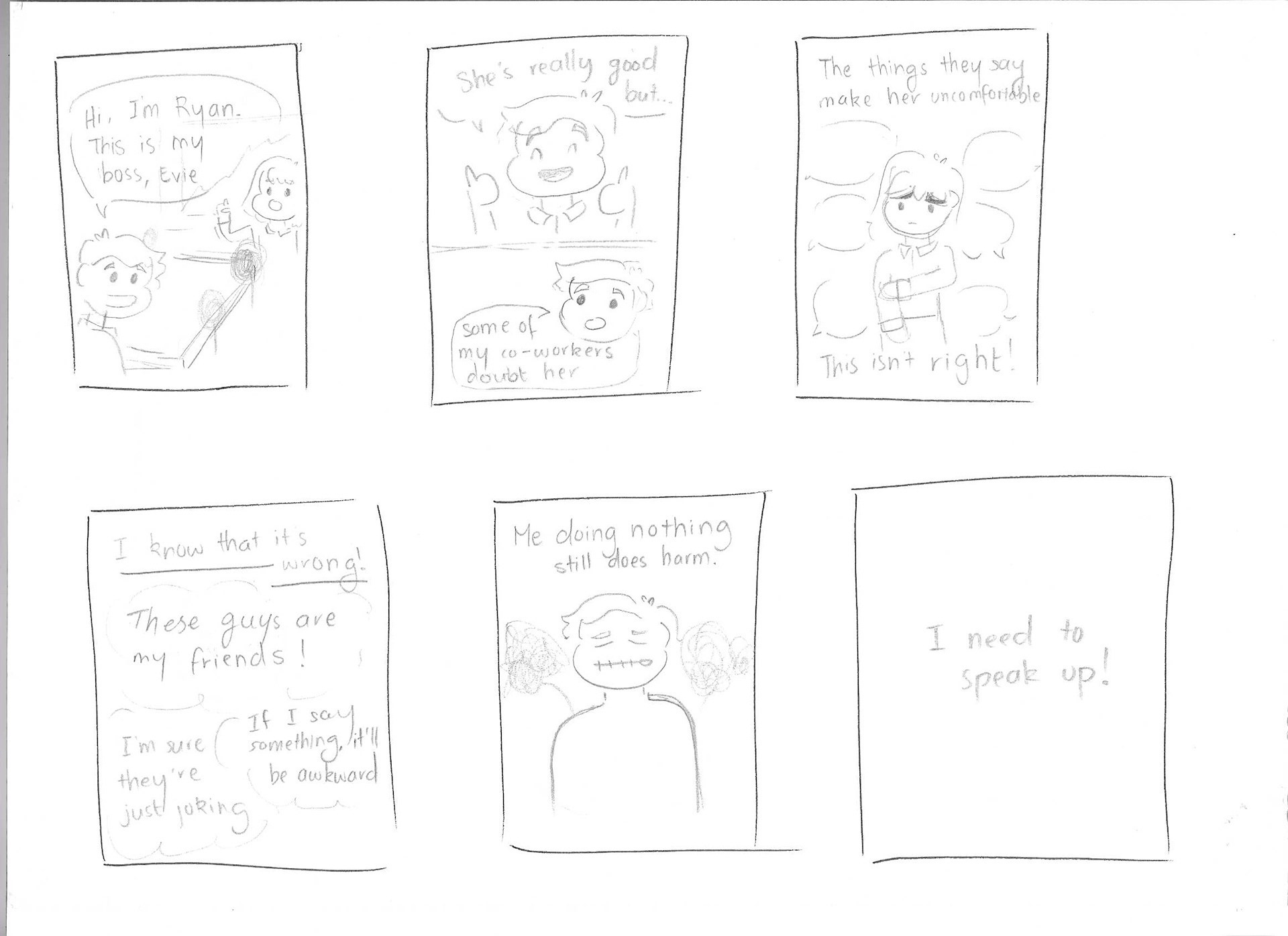
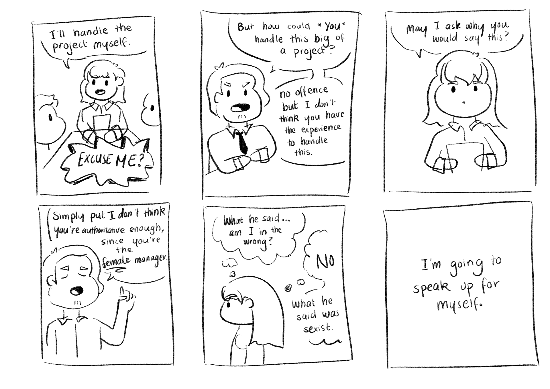
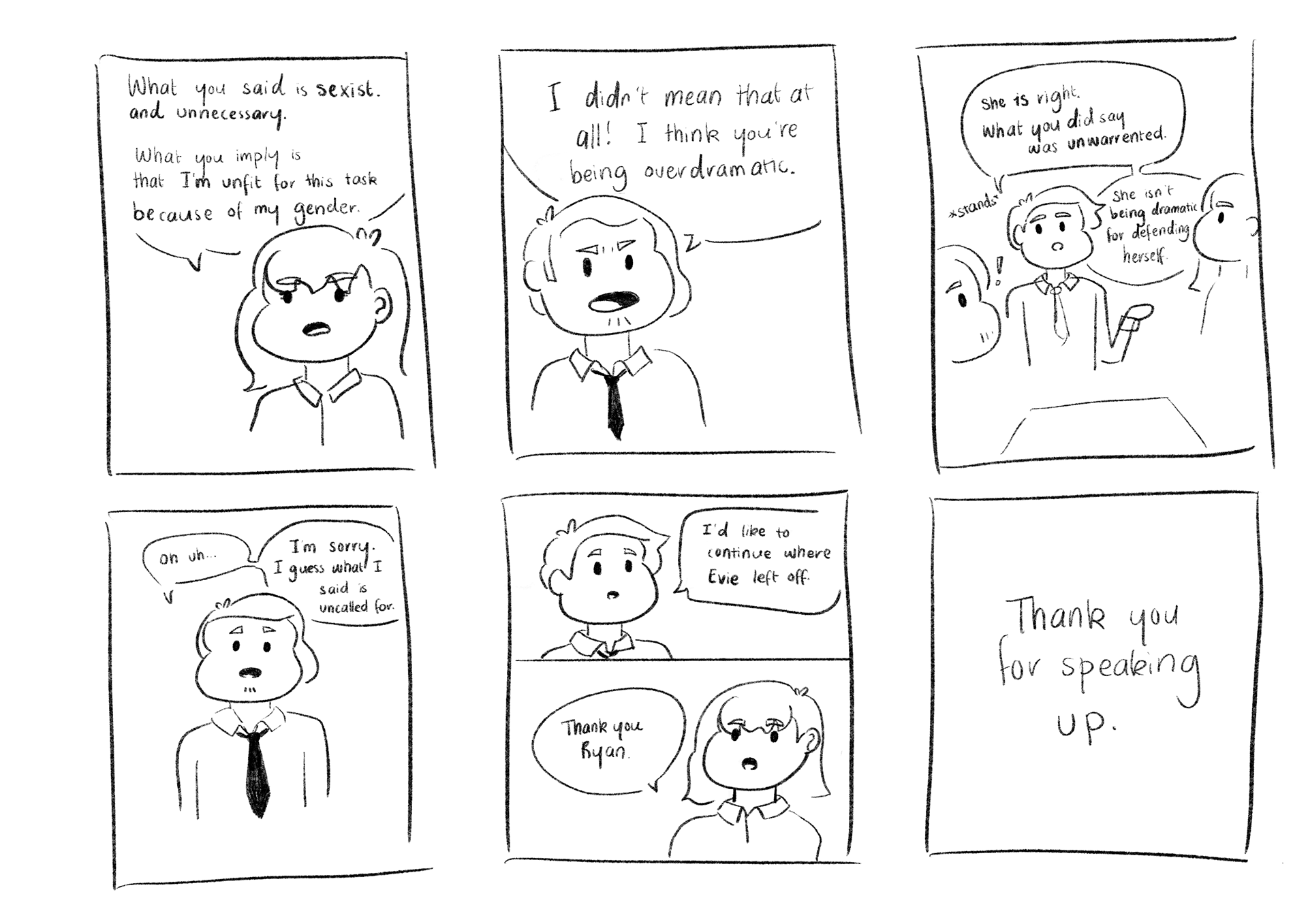
Figures 3-7: Storyboard
Visual Strategies with Design Principles
Symbolism
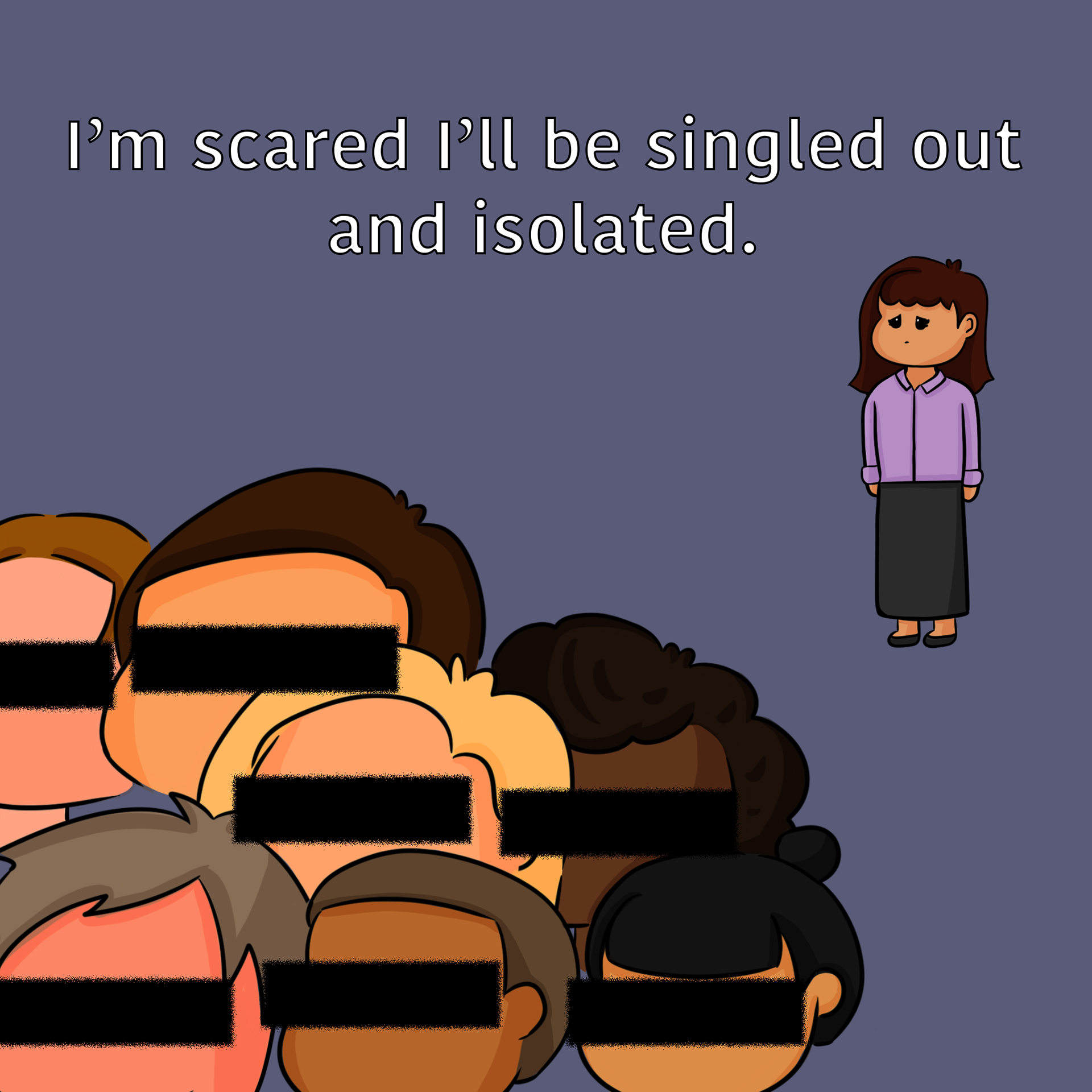
Symbolism is used in the campaign to visually communicate emotions. Within the left image, the faces of Evie's colleagues are censored out. This, accompanied with Evie standing far from the crowd depicts the social distance between her and her coworkers. The censored faces are used to symbolise their unapproachability, therefore, leaving Evie more isolated and alone.
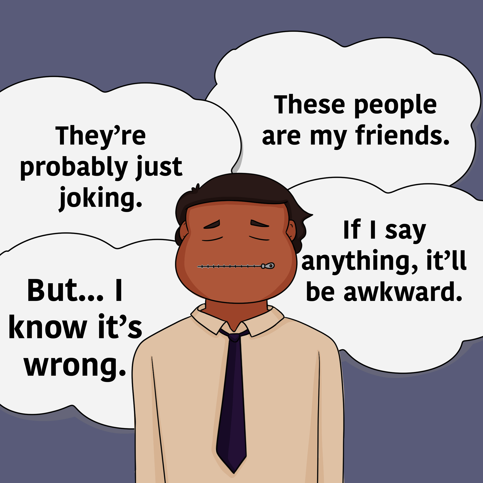
The image on the right has Ryan contemplating why he doesn't speak up against the micro-aggressions. The zipper on his mouth is used to demonstrate his silence. However, the use of the zipper means that he is able to unzip it. This allows him to finally speak up against the disrespect towards his co-workers.
Contrast and Colour
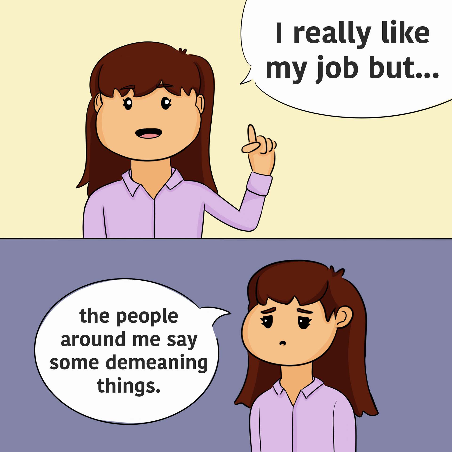
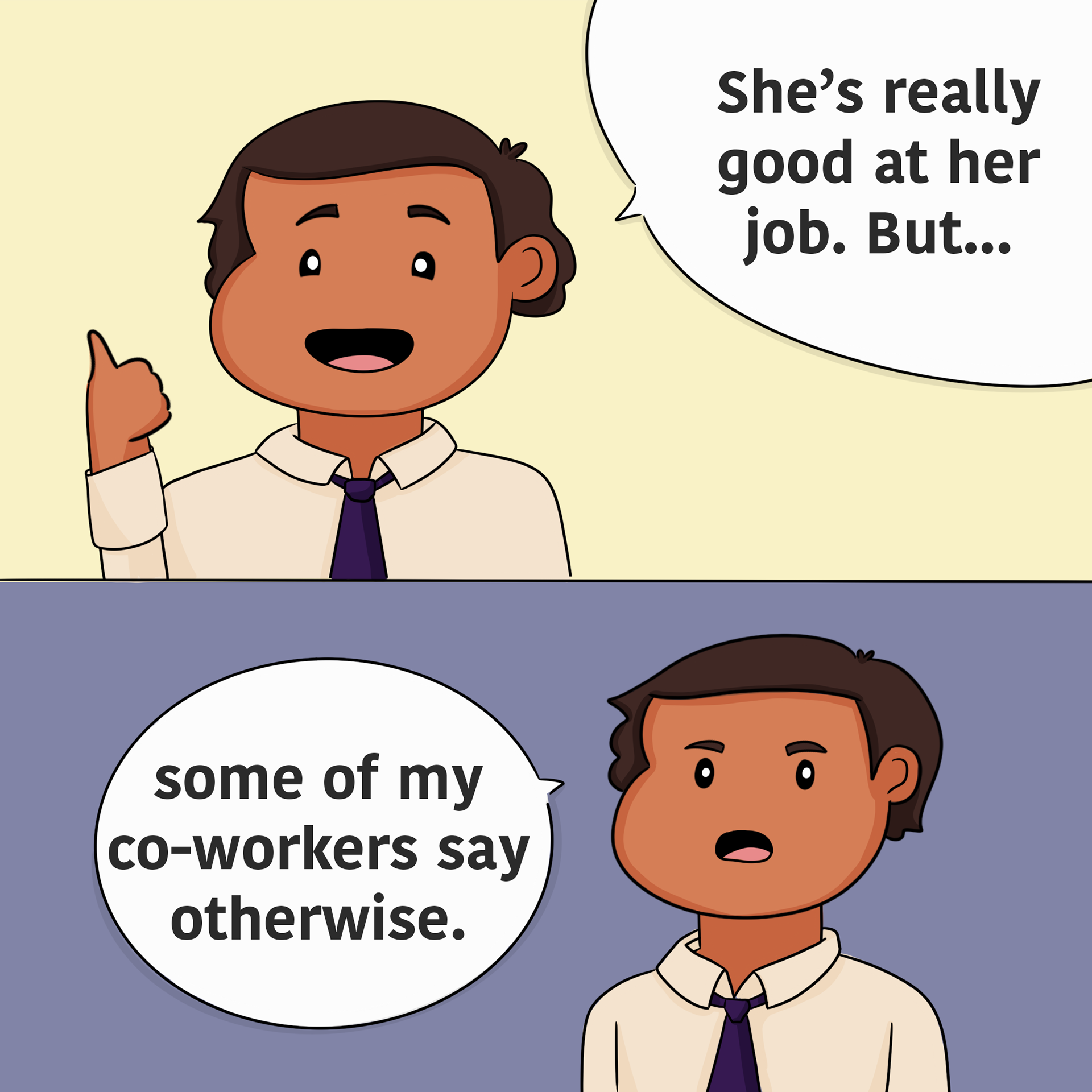
Using the colours yellow and purple were intended to showcase the different moods. The colour yellow is used for optimism while the dark purple is used to show the more serious moments. As seen in the illustrations below, the mood shifts when they begin discussing something more serious. Using a layout, split screen, it helps transition into a different mood. This complimentary colour duo also helps demonstrate boldness, conveying the message of speaking out.
Symmetry
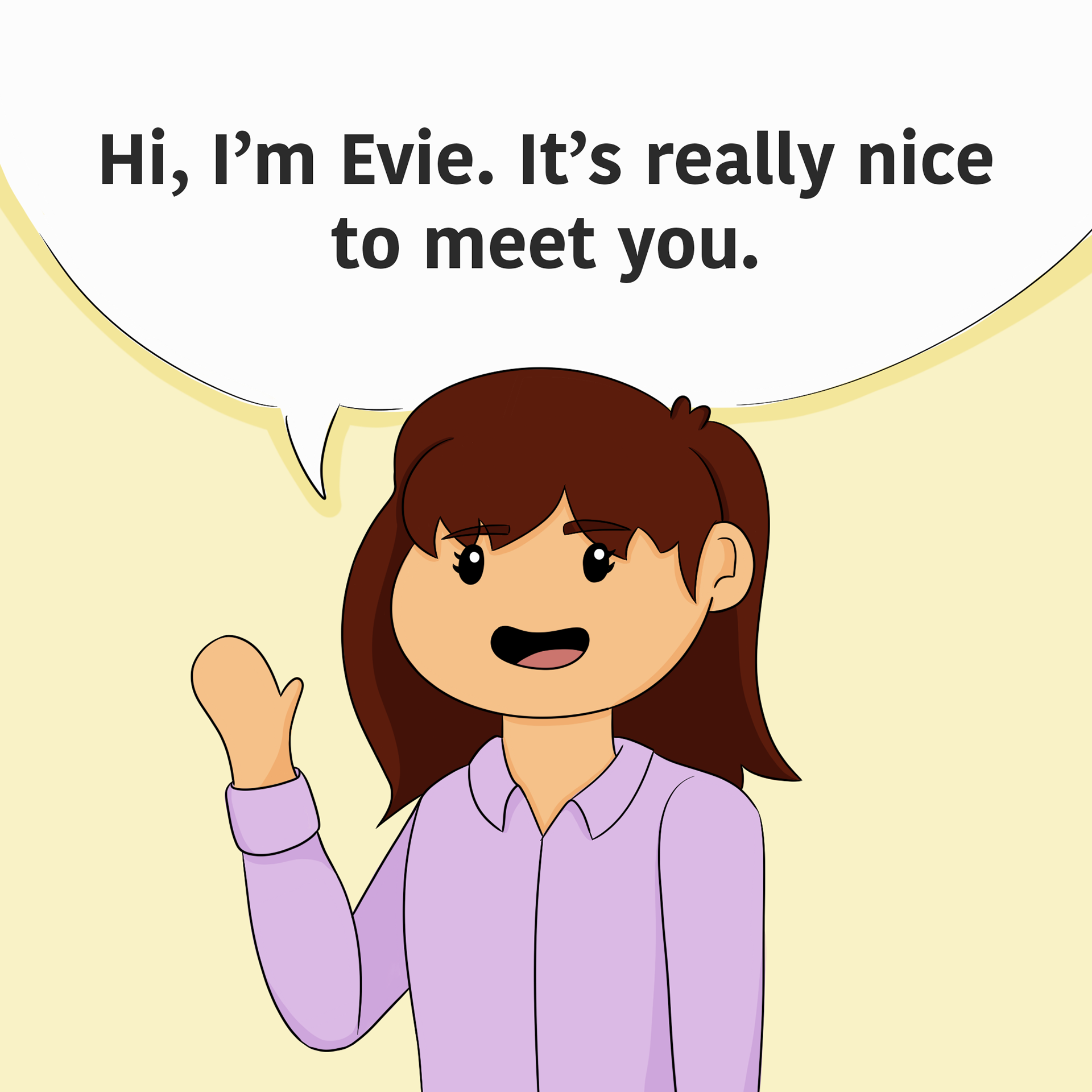
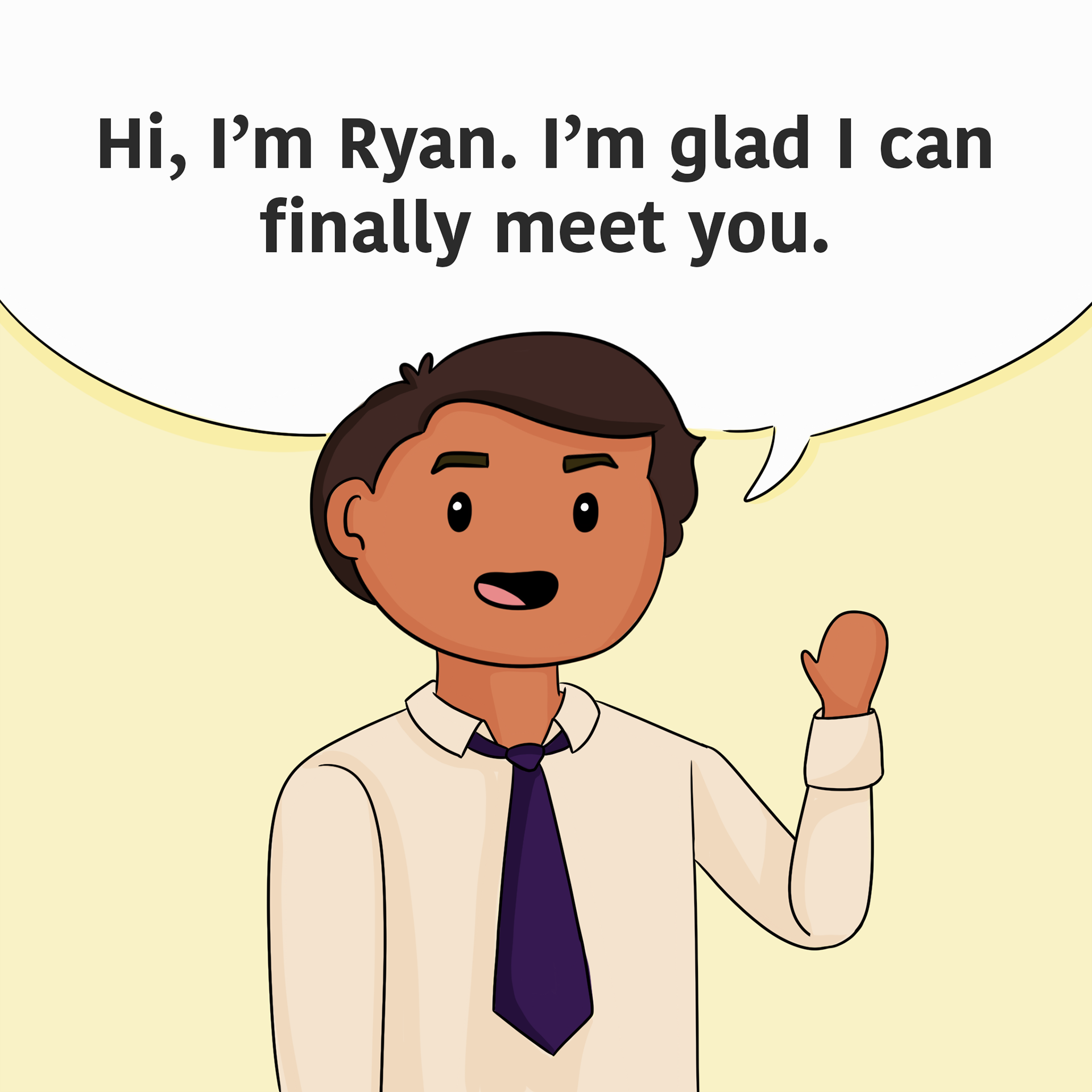
Symmetry was used to help present the story's narrative type. By using similar imagery for the character's introductions, it helps the story to be cohesive. It helps introduce the two characters into the same narrative. It also presents a visual indicator of shifting perspectives, going from one person to another. Symmetry is used to also show continuity throughout the story, showing similar events throughout the parallel narrative.
Comic Style
The comic book style is used here to deliver dialogue and perspective. The use of speech bubbles clarifies which character is speaking and who it is directed to. Text outside the bubble is directed towards the reader or an internal monologue. The comic style is demonstrated in the format on Instagram, using the multi-post feature. This style helps communicate a story cohesively. By using different perspectives as well, it helps build the world around the narrative.
Establishing the Archetype
Displaying an every-man archetype is important in present a campaign. This campaign utilises the every-man campaign to demonstrate that anyone can stand up against sexism. This is seen in the image below, showcasing different diversities. Being inclusive helps communicate that anyone can find themselves in this campaign.
Process
Software and Technologies
The software that I'll be using for my campaign is Procreate. This software program for Apple IOS specialises in hand-drawn illustration. I'll be using this program for efficiency, as I am faster at hand-drawing the characters rather than vectorising them.
Other software used will be Adobe Photoshop. Photoshop will be used to add the text and be used to edit the values on the images. It also helps combine individual drawing assets, similar to collaging. This is because it'll provide more flexibility and consistency than with Procreate.
Another software used is Inpreview. This app is used to plan Instagram layouts before posting. This will help prepare the look of the campaign before any definitive decisions.
Link to Campaign
Reflection
Throughout this process, I am happy with the outcome of my campaign. However, there were a few qualms I wish I could address for the next time.
When developing this campaign, I had a lot of enjoyment researching the social issue. When choosing which social issue to do, OurWatch sparked my interest the most. The presentation of its commercials and their cause caught my eye. The use of the hero archetype and how it depicted situations made me intrigued. It was interesting to investigate how micro-aggressions were used to discriminate and I thought it was interesting enough to display as a visual narrative. I also thought it was also important to forefront this issue as it isn’t widely unknown to the public. Exploring the reasons behind micro-aggressions, the statistics of women experiencing them and how they’ve normalised into our society did lead to a lot of research being conducted. However, I did want my campaign to be detailed and accurate to its subject matter.
When executing the campaign, what I found most challenging was the storyboarding. I had the idea of a parallel narrative by reading about both male and female perspectives. I wanted to present the campaign with nuanced information. However, I wanted the story to not follow tropes. I wanted the characters to have satisfying conclusions that didn’t hinder on clichés. I struggled coming up with a conclusion as I didn’t want the male character to become a white knight. I had to tackle the ending sensitively, or it would communicate the wrong message about my campaign. Ultimately after a lot of discussion, I had finished the story with both characters standing up. For future reference, I wish I had explored my options sooner.
Additionally, I wish I had used a different artistic method to present my story. Hand drawing digital images did lead to a detailed story, however, left the art style quite inconsistent and it became time consuming. The outcome also didn’t look as ‘professional’ as I had desired. My main demographic was young adults entering the workplace, meaning the art style could have appeared more vectorized. To solve both these issues, Adobe Illustrator would have been a more convenient solution to convey my vision.
Overall, I am satisfied with my campaign but wish I had more time to refine further details.
References
Adobe. (n.d.). Photoshop Icon [Icon]. Apple App Store. https://apps.apple.com/uy/app/adobe-photoshop/id1457771281
Adobe. (n.d.). Adobe After Effects [Logo]. Wikipedia. https://en.wikipedia.org/wiki/Adobe_After_Effects
Catalyst. (n.d.). #BiasCorrect - The Shorty Awards. Shorty Awards. https://shortyawards.com/4th-socialgood/biascorrect
createsend. (n.d.). Read for Empathy [Illustration]. Pinterest. https://www.pinterest.com.au/pin/710161435005085650/
Demers, V. (n.d.). Real Men are Feminists [Photograph]. Pinterest. https://www.pinterest.com.au/pin/710161435005105984/
Galdi, S., Maass, A., & Cadinu, M. (2014). Objectifying Media: Their Effect on Gender Role Norms and Sexual Harassment of Women. Psychology of Women Quarterly, 38(3), 398–413. https://doi.org/10.1177/0361684313515185
Garwood, M. (n.d.). Monica Garwood [Illustration]. Pinterest. https://www.pinterest.com.au/pin/710161435005085694/
Grunge. (n.d.). [Photograph]. Pinterest. https://www.pinterest.com.au/pin/710161435005105985/
Lean In. (2018). Women in the Workplace. https://leanin.org/women-in-the-workplace-report-2018/everyday-discrimination-microaggressions#!
Galdi, S., Maass, A., & Cadinu, M. (2014). Objectifying Media: Their Effect on Gender Role Norms and Sexual Harassment of Women. Psychology of Women Quarterly, 38(3), 398–413. https://doi.org/10.1177/0361684313515185
Komatsu Australia. (2019). Say Again? – Echoed at the International Quarry Conference. Komatsu. https://www.komatsu.com.au/company/news-media/news/say-again-%E2%80%93-echoed-at-the-international-quarry-con
mckinsley. (n.d.). Women in the Workplace 2021 [Illustration]. Pinterest. https://www.pinterest.com.au/pin/710161435005085637/
Onelight Apps. (n.d.). Inpreview App Icon [Icons]. Google Play Store. https://play.google.com/store/apps/details?id=io.onelightapps.inpreview&hl=en_US&gl=US
OurWatch. (n.d.). Disrespect Towards Women At Work In Australia. Doing Nothing Does Harm. https://www.doingnothingdoesharm.org.au/different-situations/at-work/
Our Watch. (n.d.). Our Watch Campaign. Doing Nothing Does Harm. https://www.doingnothingdoesharm.org.au/
Procreate. (n.d.). Procreate [Logo]. Facebook. https://www.facebook.com/procreate/photos/a.424946527551686/1986568438056146
TheConsciousVibe. (n.d.). Is Being “Too Nice” Really a Bad Thing? [Illustration]. Pinterest. https://www.pinterest.com.au/pin/710161435005085642/
Washington, E., Birch, A., & Roberts, L. (2020, July 3). When and How to Respond to Microaggressions. Harvard Business Review. https://hbr.org/2020/07/when-and-how-to-respond-to-microaggressions
