Project Outline
For this project, I will be focusing on the plastic waste and overconsumption at the Ekka. The Ekka is known for its carnival rides, iconic foods and of course, the show bags. The show bags will be the main focus, as it is a massive attraction at the Ekka and what sets itself apart from other carnival-like events. I wanted to tackle this particular event because I have very mixed feelings of the show. On one hand, it can be a fun, enjoyable time with friends and family. On the other, it is a massive, costly event that produces a ton of waste. The visual campaign will centre around the quote, "the show must go on," referring to both the Ekka as a show but also, the plastic waste that is environmentally destructive.
Campaign Goal: The goal for the campaign is to make the consumers consider their actions before committing to a purchase. Targeting a family (parents with children) demographic, as it is the main demographic for the Ekka, it'll ask the parents and children's to question and think twice about their shopping choices and environmental footprint.
Research
Waste from the Ekka
Show bags are a massive part of the Ekka. It's a staple of the agricultural show each year, garnering hundreds of thousands of sales within the 10 day span. They are such a massive staple that they can be the sole reason people attend. However, the waste created by the Ekka is astonishing. Though attempting to progress into a more eco-friendly direction, the show continues to conduct outdated practices.
Within 2018 alone, 400 thousand people attended the event, producing more than 240 tonnes of waste (Nothling, 2019). This waste number is a combination of food waste, plastic waste, general waste and more. Show bags in particular pose a big threat to waste and overconsumption. To put into perspective, the 2018 RNA reported that the total surplus of the Ekka in 2018 was $3.2 million dollars with the largest crowded since 2011 (The Royal National Agricultural and Industrial Association of Queensland, 2018). The best selling show bag, Bertie Beetle is a crowd favourite, estimated to have sold a quarter of a million bags in 2019 (Ekka Royal Queensland Show, 2019).
The reason behind such massive sales is because of its consumerist appeal. The bags represent themselves as a 'good deal' because it comes as a bundle. They start at the low price of $4, coming with an assortment of themed items. Whether it be food related, plastic toys or branded items, the options are endless (Showbag World, n.d.). However, this does lead to overconsumption and an increase in plastic production.
Figure 1: Showbags purchasable on showbagworld.com (Showbag World, n.d.)
There have been some initiative from store vendors to sell more reusable carry items such as backpacks, totes and gym bags. However, they are wrapped in plastic or made using cheap materials. There have been proposals about switching the plastic bags to paper bags, much like the original Ekka. This is unlikely to happen. This is because the mass production of the bags would significantly increase their overall cost. The demand for more sustainable options gets larger each year, the show operators realising that there needs to be a change in the forthcoming years (Nothling, 2019).
Plastic toys also have a negative environmental impact too. The large amount of plastic toys being bought yearly are contributing more and more to ocean garbage and landfills. Plastic is used because of its durability and versatility. However, it's more than likely that after 15-20 years, they'd be thrown out. This seems optimistic, but toys made from recycled plastics are rare because of their unknown chemical composition. Recycled plastics could potentially violate safety regulations for children (Brown, 2019).
Overall, the Ekka contributes to mass consumption and waste, due to its overuse of plastic materials. There isn't a simple solution though, switching from plastic to another material would be too costly. Therefore, the best way of reducing consumption is by making the buyer aware of this issue and to think twice before purchasing.
Similar Campaigns
Plastic Free July is a key campaign that sounds exactly what it is. The campaign asks its participants to be plastic-free for the month of July. It's said that the purpose of the challenge is to realise the prominence plastic has in our lives and to find better alternatives to single use plastic items such as cutlery, bottles and bags. The campaign's objective is that a small change makes a big difference, asking everyone to take part in stopping single use plastic waste (Plastic Free Foundation, 2022). The campaign visually displays a flat design style. The imagery is easy to decipher. The colour scheme is muted, going with softer pastels. This presents a very inclusive and contemporary campaign approach that also plays into the everyman archetype.
In 2017, KappAhl, Lindex and H&M created an initiative called One Bag Habit. The campaign charges for plastic bags at participating stores. Lindex then donates the earned money to other campaigns that support sustainable developments. Charging for plastic bags have worked, as only 30% of customers had purchased a bag within the first seven months (EPR Retail News, 2018). The campaign targets female retail shoppers as their primary audience. The cost incentive does increase the effectiveness of the campaign. Because of the plastic bag ban implemented by the Queensland Government, this could propose an answer to helping reduce bag production.
Figure 2: One Bag Habit (KappAhl, 2017)
This post made by cliterallythebest on Instagram uses contrast and shock factor to convey their message. This campaign image contrasts a bag of vibrant sex toys to a bag of violent guns. It makes the reader question the absurdity of the situation, asking "how could the bag of guns be the legal one?" Inspiration from this campaign includes making the reader ask twice and consider the circumstances. This can be conveyed through the absurdity or through a drastic thematic change.
Mood Board
The mood board above uses a mixture of pastel and fluorescent colours depicting a carnival or nightlife scene. I wanted the mood board to express the fun carnival atmosphere, exemplified with the sugary pastel pinks and purples. The contrast between the lighter and darker scenes was intentional. I would like to incorporate the change in colour as a defining focus as it'll create a meaningful contrast between the positive and negative images. The pastel images depict a more lighthearted mood, the digital style of the typography and pattern capturing the whimsy and bubbly fun at the Ekka. The darker colours photos contrast this, the photography being grittier and mysterious. The fluorescent colour almost feels nauseating with its intensity. Overall, the mood board creates a good basis in how I want the poster to be expressed.
Planning
Storyboarding Ideas
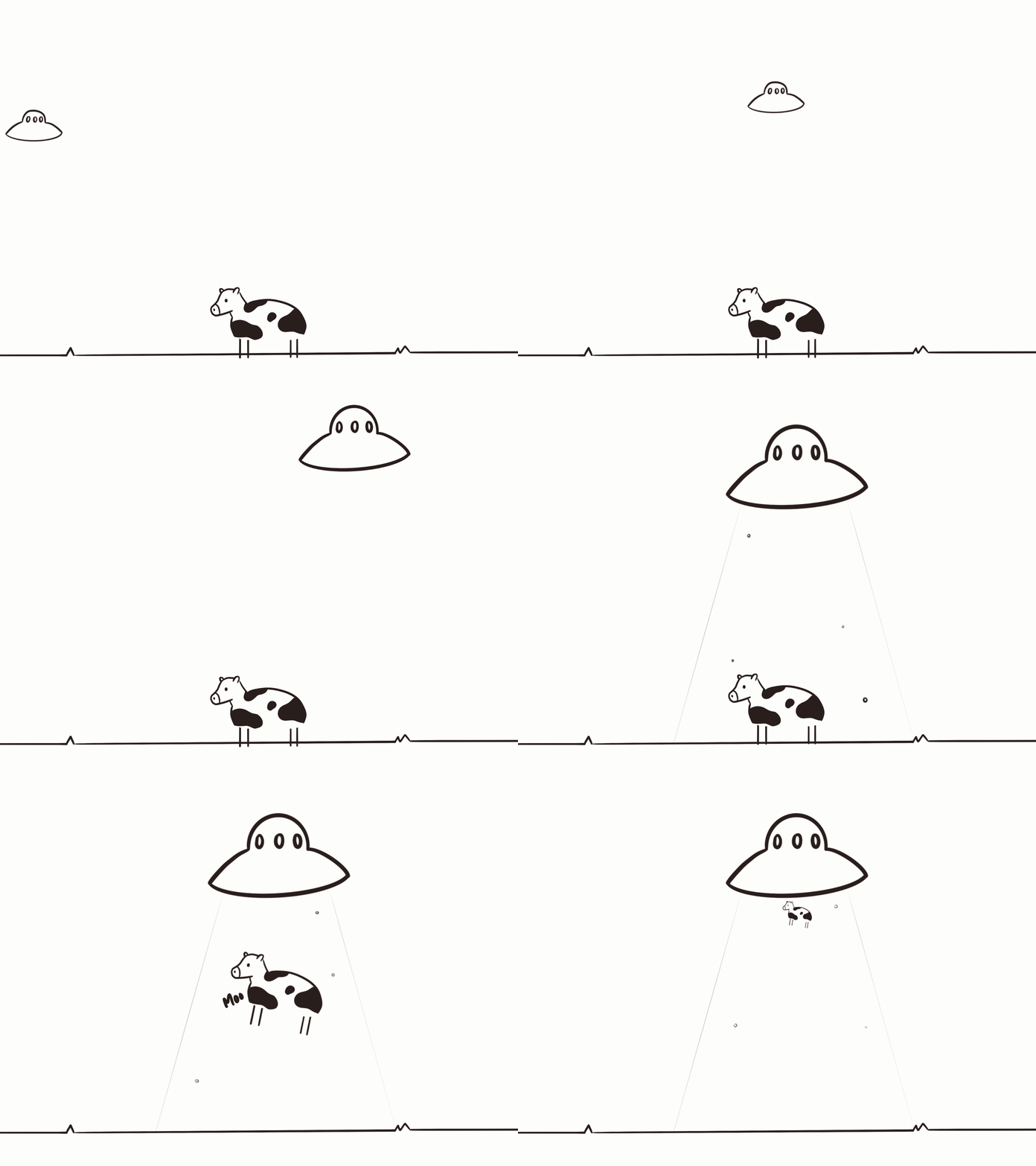
This first storyboard idea centred around the plastic waste produced by the items and how easily disposable they are. The idea of the bag and toys slowly disintegrating explicitly shows the effects of plastic over time. However, this doesn't throughly present the Ekka holiday, as it is just generalised to be about plastic waste. The animation is always quite short and basic, not presenting a full and cohesive story.
Figure 5: Storyboard idea 1
This second idea was more focused on the idea of time progression. This displays the character age rapidly while the bags stay relatively the same. It uses shock factor when she turns into a skeleton, showcasing how plastic is truly forever. The main positive of this poster is the linear timeline. It effectively conveys the message of plastic being eternal using such a clear depiction of passing time (character ageing). Additionally, this poster better displays the enjoyment of the Ekka holiday, showing the girl holding up her bag of toys and sweets. The biggest flaw associated with this poster is the use of the shock factor. Because the Ekka's demographic is primarily families with children, the depiction of a skeleton would appear very graphic. The purpose of the campaign is to make people reconsider and think before purchasing, not detour them from having a fun time.
Figure 6: Storyboard idea 2
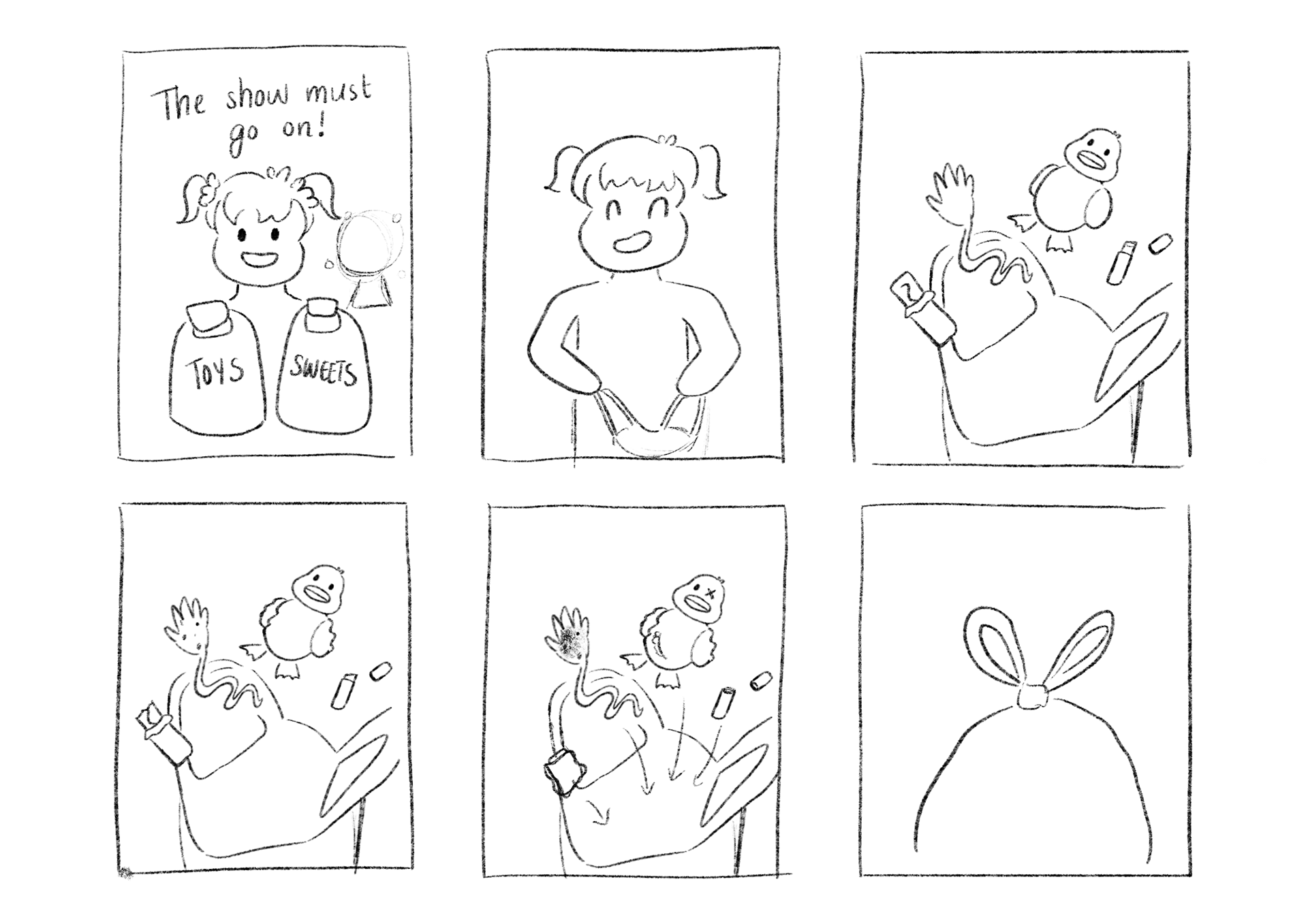
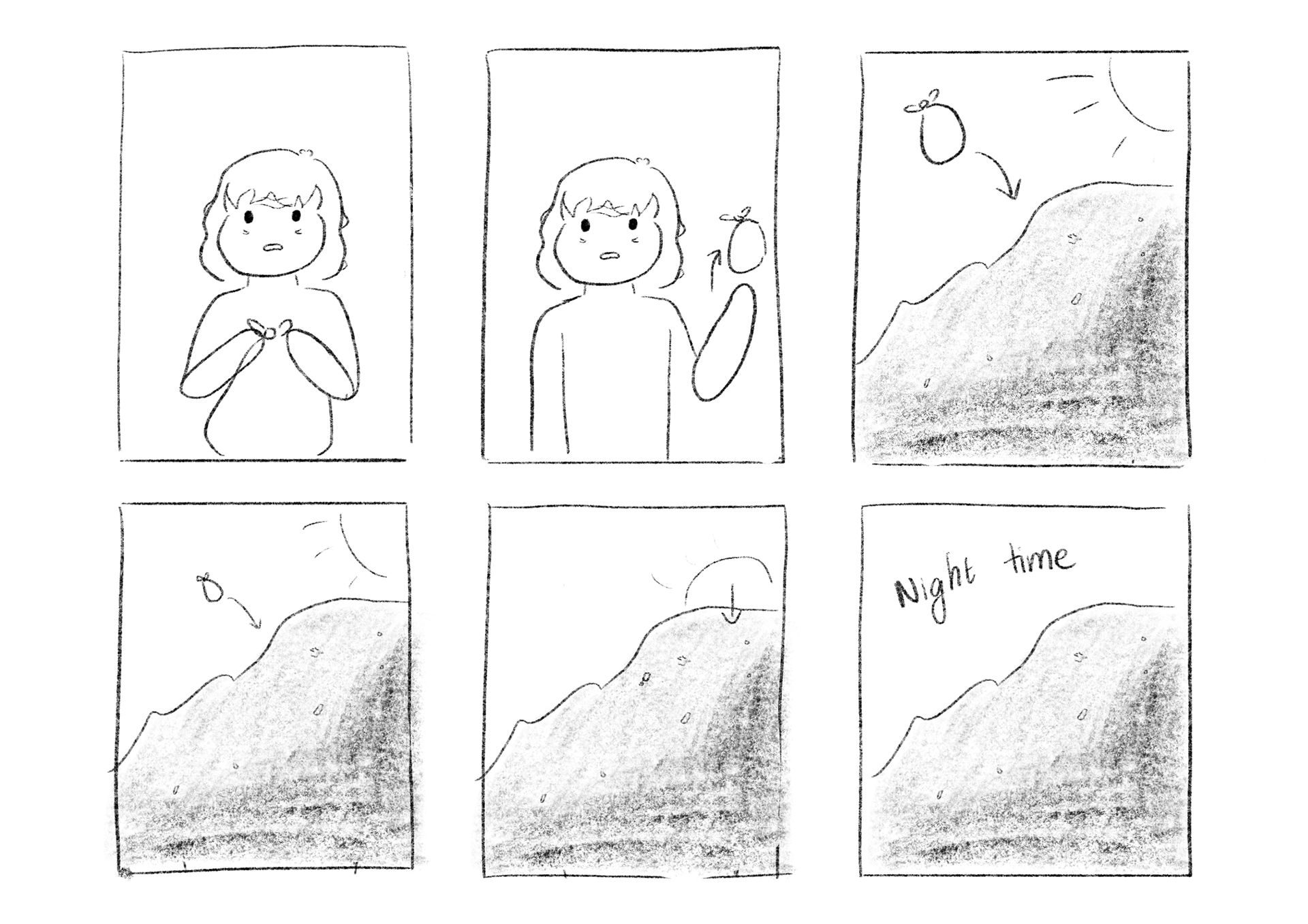
Figure 7-8: Final Storyboard
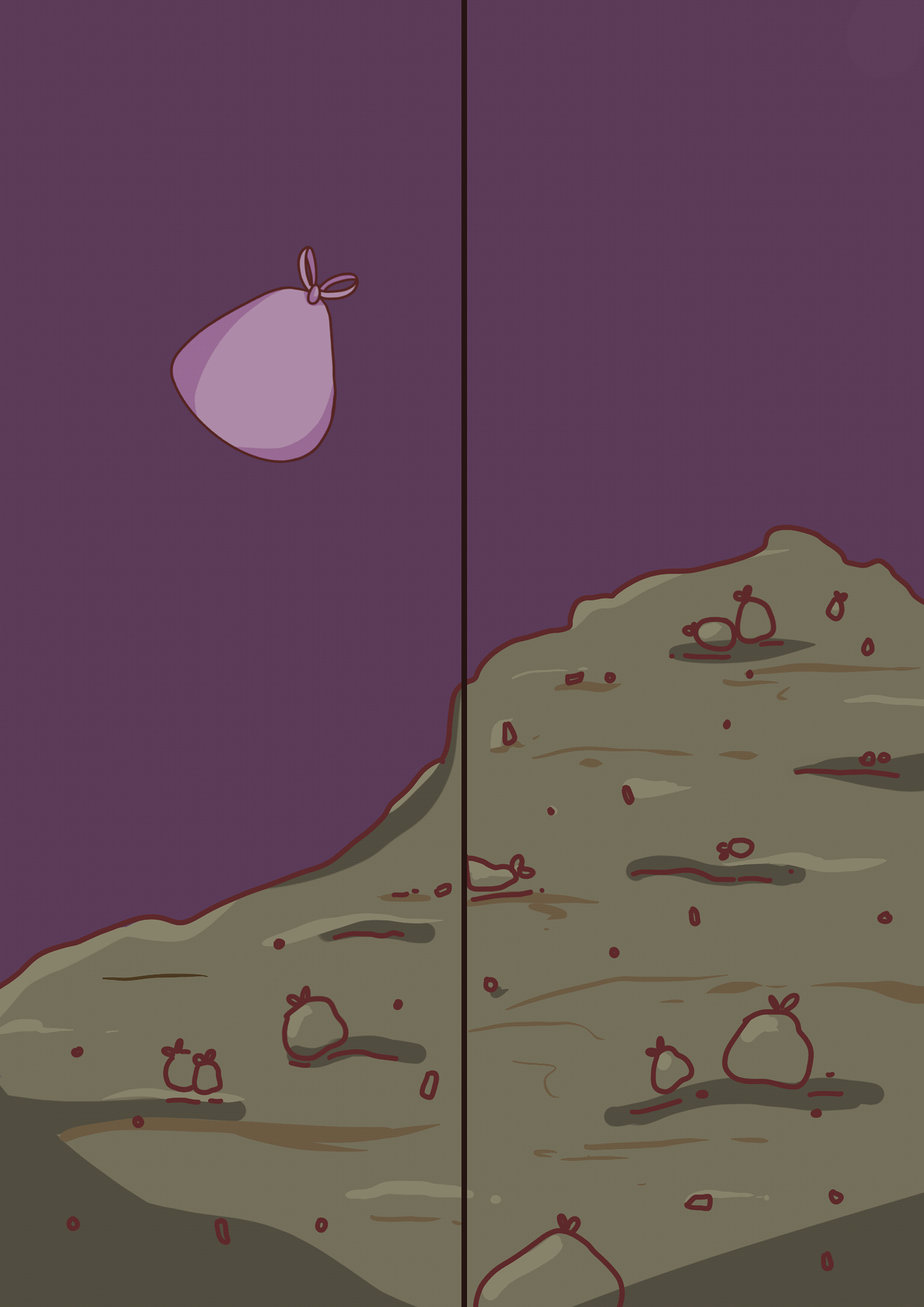
In order to accommodate for the advantages in both posters, they were simply combined. The second poster better conveyed the Ekka celebration, being able to set the carnival environment in the background. The toys in the bag poster better conveyed the negatives of plastic use. The main poster will cut to this, showing the toys ageing and decaying over time. The poster will cut back to the character as an older woman, showing a drastic change in time. This would also demonstrate the linear timeline the story is taking place in. Finally, the character will tie the bag of trash and it'll cut to a waste pile. This will conclude by showing the astonishing amount of plastic waste. The quote will also end with, "on... and on..." to complete the message.
Visual Strategies
Pop-Culture Reference and Text
Using a well known quote such as "the show must go on," uses cultural association and pun. The use of the quote allows for immediate association with the viewer. The quote is typically used when something has gone wrong, but it shouldn't effect the enjoyment of the theatrical production. This can be applied with the context of COVID-19 and the Ekka, as the event has been postponed until further notice. The audience can connect the dots of 'the show' meaning the Ekka or any carnival-like event. However, the addition of "and on... and on..." after showing the holiday's plastic waste shifts the meaning of the original quote. The new meaning insinuates that the festivities are ever-lasting because of incessant, slowly degrading plastic waste.
Character Study - Lucy
Narrative Type - Linear
The linear narrative type is depicted in how the character is seen ageing. She starts the poster being a bright-eyed girl, with distinct childhood pig tails. The older version of her then has wrinkles, grey hair and wears more muted, neutral colours. The bag of items degrading is the rising tension, creating the problem. The bag being thrown out is then the story's conclusion. This clear depiction of time presents a beginning, middle and end.
The display of her ageing so rapidly also presents a shock factor to the audience.
Colour and Contrast
The change in colour again shows the mood change from joyful to upsetting. The main poster has a more vibrant colour palette, sticking with pinks, purples and blues. They're brighter and more saturated to portray the feeling of positivity. The vibrant pinks and the candy mint-blue are commonly associated with sweet, tooth-rotting sugary treats or pastel trends. This colour palette gradually shifts to a dark and dingy colour scheme. The first background's lighter purple has turned into a dusty violet. Lucy's clothes have changed from the bubbly pinks to a plain brown and mustard yellow. Put simply, this contrast from light to dark shows how the poster transitions from a positive perspective to a darker message. The ending of the animation appears to have "sucked the life out of" the poster, to show the ending in a very negative way.
Symmetry and Asymmetry
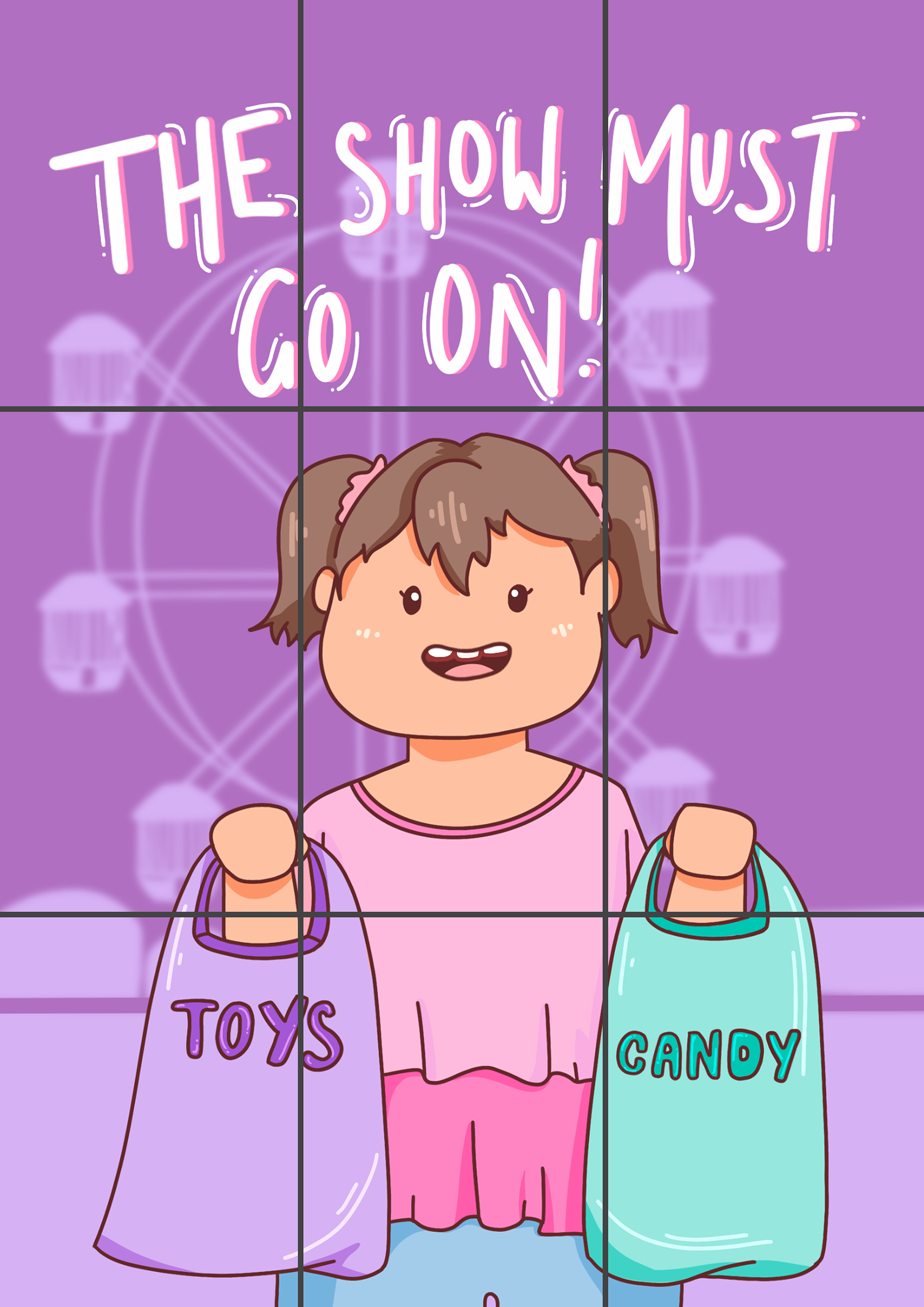
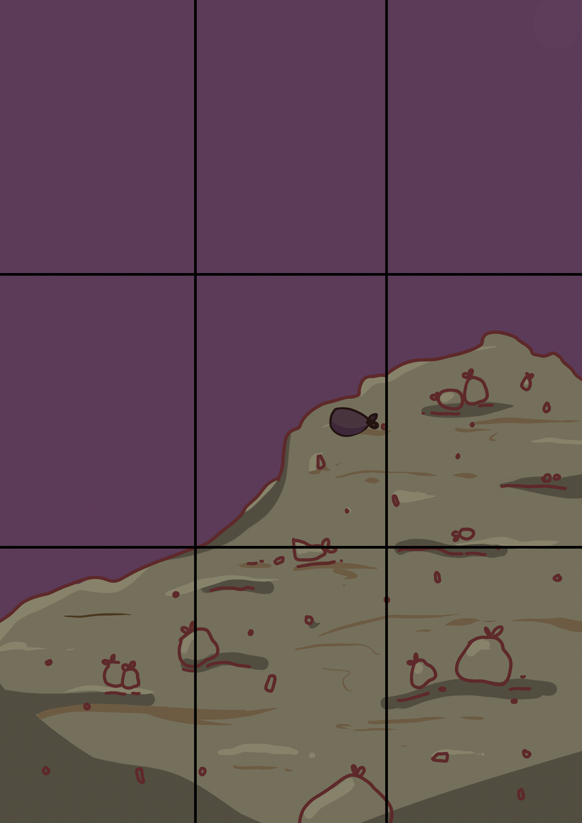
The use of symmetry creates compositional balance. This then portrays harmony and destress respectively. The first image of Lucy holding the show bags is more harmonious because of she has a centre alignment. Her body is facing forward, symmetrical along the middle. In comparison, the junkyard is asymmetric with the right side of the composition occupying more space. This presents itself as uneven, displaying the unsettling mood the scene is supposed to portray.
'Z' Rule / Hierarchy of Information
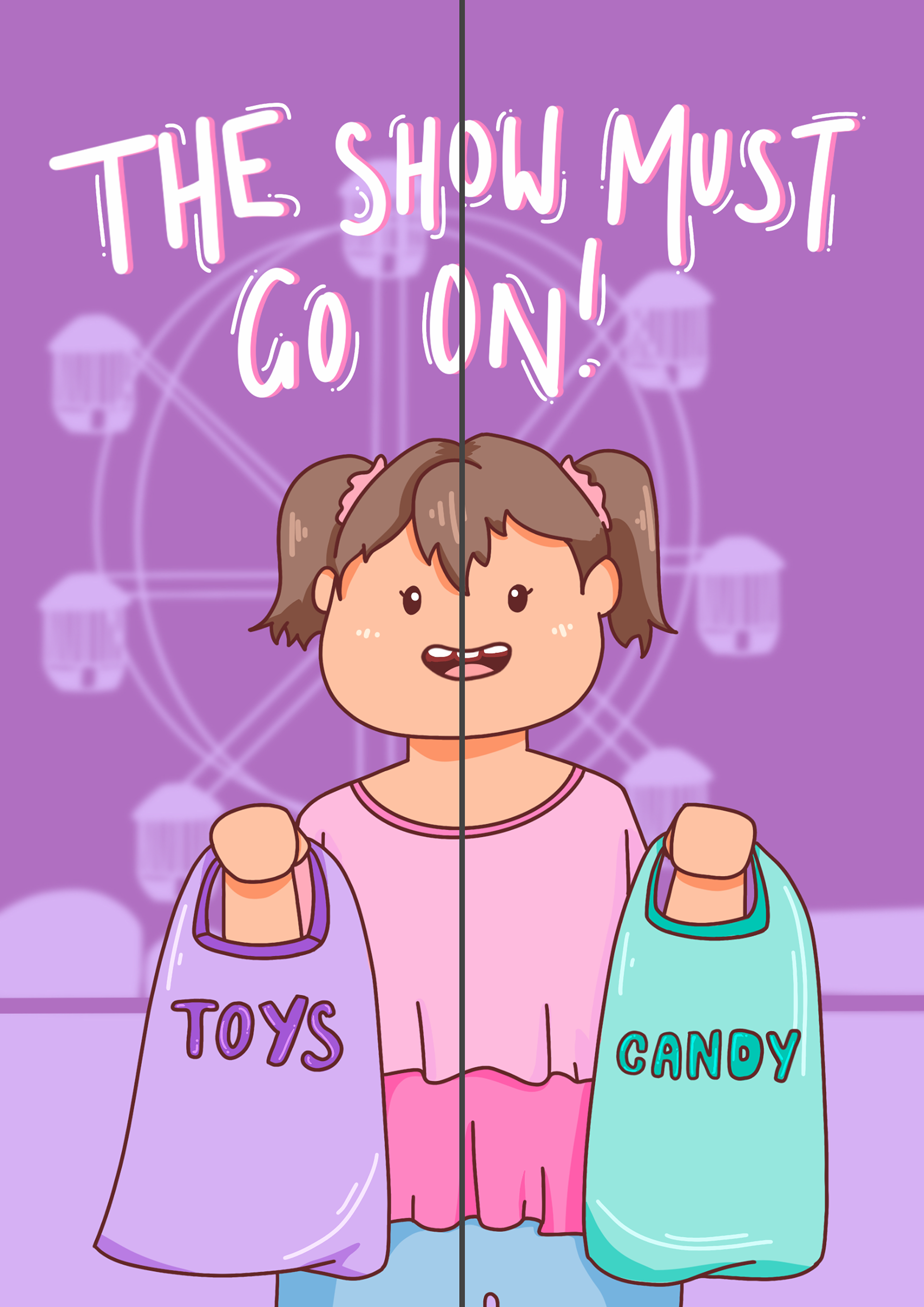
The hierarchy of information is communicated on the poster based on the 'Z' rule. The 'Z' rule is the Western way of reading compositional information, as it is read left to right. The 'Z' rule is depicted in the poster by first, reading the heading text. The eye then travels diagonally across the composition, the viewer's focus drifting to Lucy and the carnival background. The eye resolves reading across the bottom from left to right. This is where the viewer picks up the importance of the showbags. This hierarchy of information is distributed this way in order to convey the campaign's message effectively. It first presents the holiday/event, then the character's presence and finally the main message.
Proximity
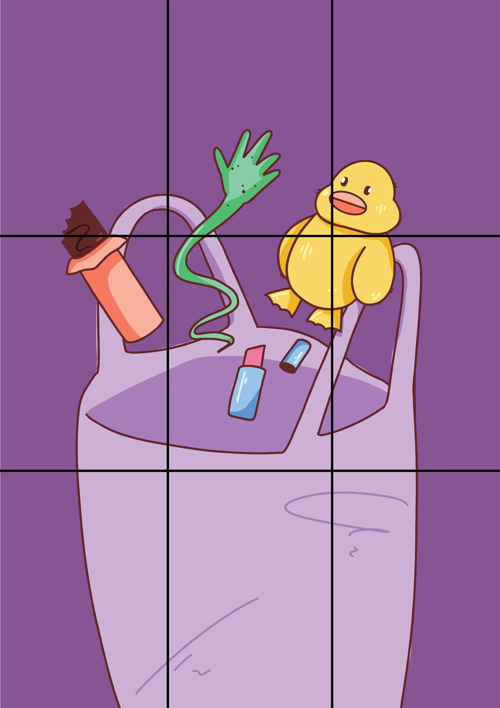
The proximity and grouping of items inside the bag represents a shared relationship. The gradual plastic decay of one items is directly connected to all the items shown within the bag. This also exemplifies that this is an issue present in all plastic items, not just a select few.
Rule Of Thirds
The structure of information follows the rule of thirds. This rule is used to convey visual aspects in a way that emphasises certain areas and intersection points. This is used to create spacial harmony on the composition. The poster is divided amongst this rule of thirds, the text among the top third row while Lucy occupies the bottom half of the page.
The majority of the toys fits in the bottom half of the composition. This is to not drastically move the viewer's eye from Lucy to the new focus. One of the intersection points is located on the duck plushie. I wanted the duck to be the main focus out of all the items as it shows the most drastic decay. The duck plushie also would contain the most impact after transforming as it would most likely possess the strongest emotional relationship with the audience (a childhood toy being worn out).
Finally, the dumpster scene occupies the bottom row and the middle row except for the left cell. This makes the composition seem unbalanced and creates compositional tension. This then portrays the unsettling nature of the scene.
Software
With Procreate, illustrative skills such as digital drawings are used. Procreate additionally supports animation, meaning that GIFs and animated sequences can be drawn in the program. This software is used primarily in the poster and the AR images to maintain a cohesive aesthetic style.
To combine the images and create the GIFs, Photoshop was used. This was also used to make sizing adjustments and ensure everything transitioned nicely.
Final Poster
Reflection
Once reflecting on the entire design process, I love the outcome of the AR poster campaign. I personally love the outcome of the poster and the art style it uses. It perfectly captures the mood and messaging that I wanted to deliver to the audience. The poster ended up very polished and matches the family friendly demographic. I am also proud I was able to combine my two storyboard ideas into one cohesive story. The animation once the poster is scanned, is choppier than desired and there are a few colouring errors. However, even with these slight mistakes, it doesn’t affect the enjoyment and cohesion of the poster. It is still successful in communicating the main message of the campaign. I am very proud with what I was able to achieve when designing and creating the campaign images.
The weaknesses I experienced were finding relevant research and incorporating visual principles. Finding relevant research to the campaign stuck mostly to plastic waste and consumption, which was the main direction of the campaign. Nevertheless, I would still have liked to find more information pertaining to the Ekka or similar shows. I found I had to research general information rather than specific carnival shows as this is an overlooked area of overconsumption. Especially in terms of waste, I couldn’t find much on showbag sales, other initiatives, or popularity other than what was found on the company’s website and a few new articles. The reason for this is primarily because the Ekka has been postponed since the pandemic. If I were to redo the initiative, I would have probably gathered my own firsthand research or research the manufacturing side of plastic production.
Another weakness was the implementation of visual principles. Though I did use a multitude of visual elements in my poster campaign, I wish I could have incorporated more to further push the final messaging. Additionally, if time allowed, I would have loved to make a clear moral ending. Because it is targeted to a family demographic, I would have liked to make a moral more explicit in case the audience missed the point. This could be in the form of ending message or an initiative on solving the solution.
Overall, I am very happy with the outcome I came to after encountering many mishaps. If I was granted the opportunity to redo certain aspects of the campaign, I would like to have more areas of research, more visual principles and a more explicit moral.
References
Adobe. (n.d.-b). Adobe Photoshop [Logo]. Logos-World.Net. https://logos-world.net/photoshop-logo/
Allyson C. (n.d.). Pink, purple and blue colour palette [Illustration]. Pinterest. https://www.pinterest.com.au/pin/710161435006518224/
ANAUSSIEINTOKYO. (2018). Explosive Rainbows [Photograph]. Flickr. https://www.flickr.com/photos/147559084@N07/27668100247
Brown, L. (2019). Plastic toys: Is it time we cut back? BBC News. https://www.bbc.com/news/science-environment-47868871
cliterallythebest. (2022). Only one of these bags is legal in Texas [Illustration]. Instagram. https://www.instagram.com/p/CeEIZ9jMTUD/?utm_source=ig_web_button_share_sheet
Ekka Royal Queensland Show. (2019). Fast Facts. Ekka. https://www.ekka.com.au/media/fast-facts/
e.milyjanee. (n.d.). Girl holding fairy floss at carnival [Photograph]. Pinterest. https://www.pinterest.com.au/pin/710161435006494553/
EPR Retail News Editors. (2018). Lindex donates 280 000 euro to STEPS and WaterAid through the One Bag Habit initiative. EPR Retail News. https://eprretailnews.com/2018/01/18/lindex-donates-280-000-euro-to-steps-and-wateraid-through-the-one-bag-habit-initiative-9632966153413/
Kappahl. (n.d.). One Bag Habit. https://www.kappahl.com/en-US/campaign/one-bag-habit/
Lorita. (n.d.). Emerald Rose Cosmetics [Illsutration]. Pinterest. https://www.pinterest.com.au/pin/710161435006518020/
Nasty. (n.d.). Purple and white checkered pattern [Pattern]. Pinterest. https://www.pinterest.com.au/pin/710161435006518229/
Nothling, L. (2019). Brisbane Ekka showbag sellers face pressure to reduce single-use plastic. ABC News. https://www.abc.net.au/news/2019-08-14/ekka-showbags-face-pressure-against-single-use-plastic/11408766
Plastic Free Foundation. (2022). About - Plastic Free July. Plastic Free July. https://www.plasticfreejuly.org/about-us/
Procreate. (n.d.). Procreate Logo [Logo]. Procreate. https://procreate.art/
Rainbow Aesthetic. (2018). Neon carnival ride at night [Photograph]. Tumblr. https://iwritepoemsandtragedies.tumblr.com/post/175107470913
Showbag World. (n.d.). Products - Showbag World. https://showbagworld.com/collections/all
The Royal National Agricultural and Industrial Association of Queensland. (2018). 2018 Annual Report. RNA. https://www.rna.org.au/media/895626/rna0716%20annual%20report%202018-final.pdf
vamp. (n.d.). Rainbow Light Staircase [Photograph]. Pinterest. https://www.pinterest.com.au/pin/710161435006518235/
