Design Critique - Cleaning Product
Jif Power and Shine
1. How many typefaces were used?
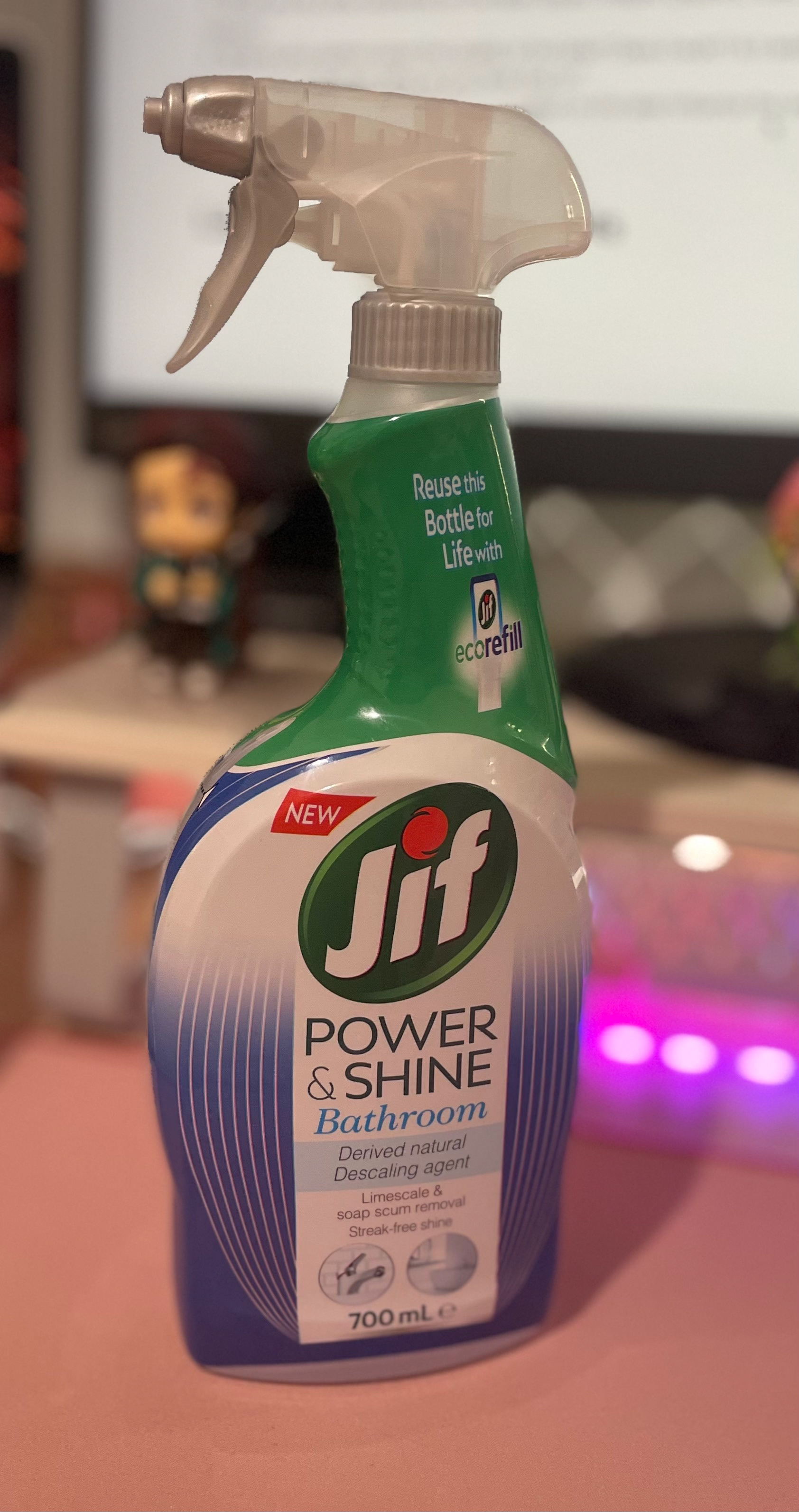
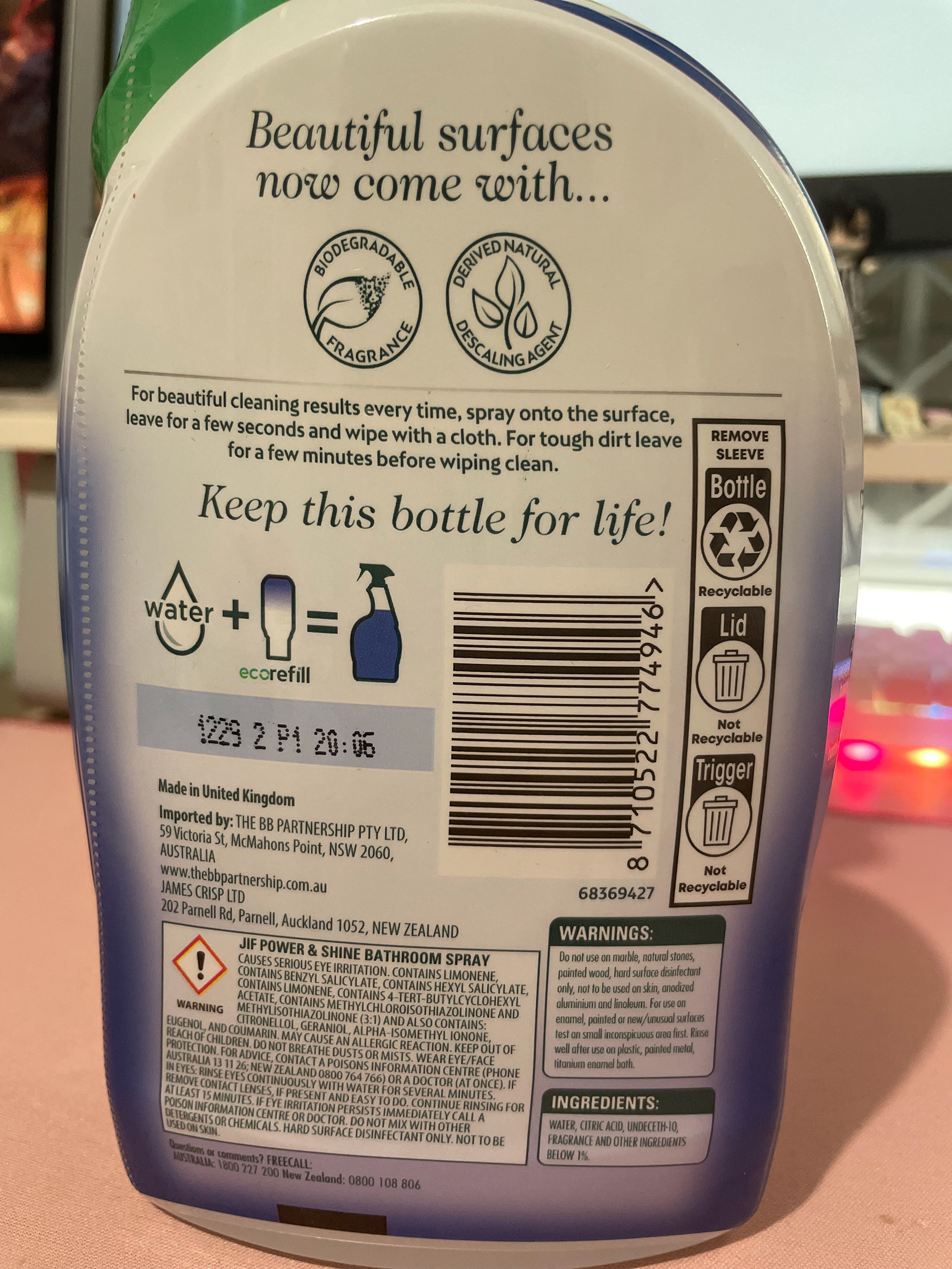
There are approximately 6 typefaces on the spray-bottle.
2. What kind of typefaces are used and how do they relate to each other?
The majority of them are san-serif, but there are approximately one that are serif typefaces. The serif font is used for the word 'bathroom' and quotes on the back. The majority of the san-serif typefaces stick to capital letters such as the subtitles and the warning hazards. The san-serif type faces are all quite thin, only the subheadings being a part of the bolded font family. Otherwise, the san-serif typefaces have easily readability, even the ones on a smaller scale.
3. How did the designer use space and alignment to organise the text?
On the front of the bottle, the font is centred aligned. The spacing of this text is restricted to a column of white in the centre. This was most likely to organise the text is a formulaic and readable manner. On the back, the top half of the label is centred align, these include the serif quotes mentioned before. The smaller scaled text towards the bottom is then left aligned for easier reading. The back of the label is more cramped, confining the text to a small boxes to seperate its content.
4. What were the treatments used to differentiate text and organise information — size, scale, treatment (colour, effects)?
The hierarchy of text is differentiated by the different treatments of the text. As displayed on the front of the label, the most important information is displayed using bigger sizing, bolder fonts and displayed higher up on the label. The logo is displayed first, then the subheading, then area of use, followed by smaller features. This particular structure effectively communicates the most important information first, by making it stand out more. Other aspects such as colour and weight; the colour of the brand's logo, subheading and 'bathroom' stand out amongst the neutral grey text. The weights of these typefaces too, become lighter the less important the information becomes.
5. What are the other elements on the label (logos, images, graphics, rules, background colours)
The bottle displays the brand's logo, images and icons. The logo displays the brand name, being the biggest image on the bottle itself. This is also displayed at the top of the text hierarchy, communicating as the most important information. The icons are used to communicate instructions such as recycling and refilling. Likewise, there are images of the bathroom on the front, displaying the effectiveness of this bathroom cleaner.
6. What is your opinion about the quality of the label? Does it work? Is it aesthetically pleasing? Is it effective? Why do you think that is?
The label does portray a 'cheap yet effective' look that many lower costing products have. The mixture of elements (type, imagery and overall design) does portray that the spray is effective in portraying its higher quality. This design personally, does convey an essence of brand loyalty; a product will continue buying over and over again. However, it isn't considered to be aesthetically pleasing because of the over abundance of content being displayed.
7. How does the use of type and its organisation on the label influence the aesthetic quality and efficiency of this label?
As stated previously, the over abundance of contrasting elements does downplay the aesthetic quality of the bottle's label. Most aesthetic designs nowadays venture towards minimalism and pastels, softer and more minute tones. This bottle contrasts this with bold blue and green colours and an overload of information. This is conveyed in its variety of typefaces on the front side alone, and the confined spacing within the label. Though this does diminish the label's aesthetic appeal, the boldness of the type and the other aesthetic features does help portray the bottle as highly effective and powerful.
Label Design - Glow Naturals
Two Typefaces and One Colour
This label utilised contrast to convey the bottle's messages effectively. The two fonts, Carina Pro and Montserrat, are serif and san-serif typefaces respectively. The serif typeface was used as the brand logo as it is more stylised. The san-serif typeface is used for less presentational but more informative text. The smaller sized font was used for readability against the blue colour. The font families also was dictated by importance of information. The subheadings and most necessary information was bolded. The hierarchy of text descended to regular and then thin fonts. Hierarchy also impacted scaling of text. The Carina Pro typeface was used in a larger sized, as it was communicating the star features of the product. This gradually got smaller.
One Typeface and One Colour
The second label specialises in alignment and spacing to communicate. The most important information, the brand name and product, are centre aligned. This gives the presentation of a title and sub-heading. The information of the brand being local, non-toxic and ultra-concentrated are aligned and spaced out like in a sentence. The below row spacing acts as dot-points to communicate three different messages. The next most important information rotates the label's orientation. This is used to continue the line of view to the instructions and ingredients. The choice of san-serif typeface (Objektiv Mk2) is used to allow an abundance of font families, as seen with the use of XBold, book, italic and thin.
One Typeface and Two Colours
Finally, the third label does similar typographic traits as the other two. The use of different sizes to demonstrate type hierarchy, different font families to communicate importance of information, alignment to aid with readability. This label uses shapes and colour contrast to help present information. The typeface, All Round Gothic, was chosen to portray the messaging of friendly. This was due to its combination of circular counters and bowls with linear lines.
References
Xvect Intern. (n.d.). Cosmetic skin body oil bottle packaging mockup Free Psd. Freepik. https://www.freepik.com/free-psd/cosmetic-skin-body-oil-bottle-packaging-mockup_24392496.htm#page=7&query=bottle%20label%20mockup&position=44&from_view=search
