Link to Game
Game Showcase
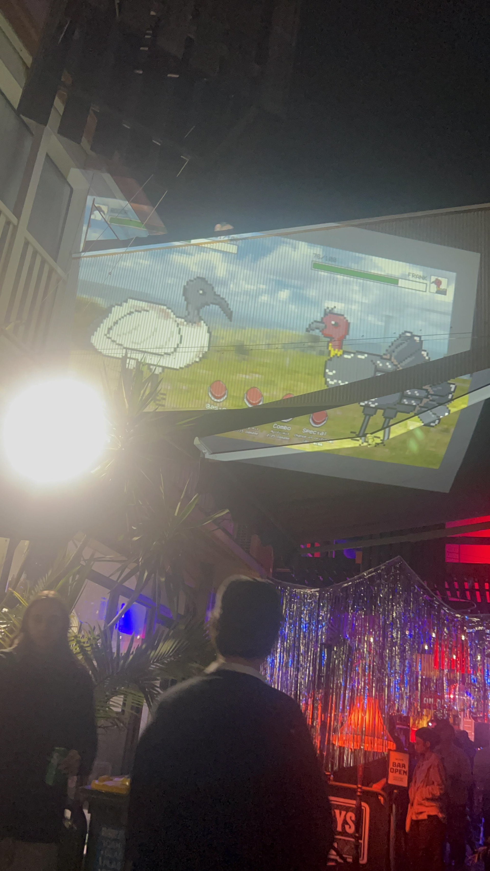
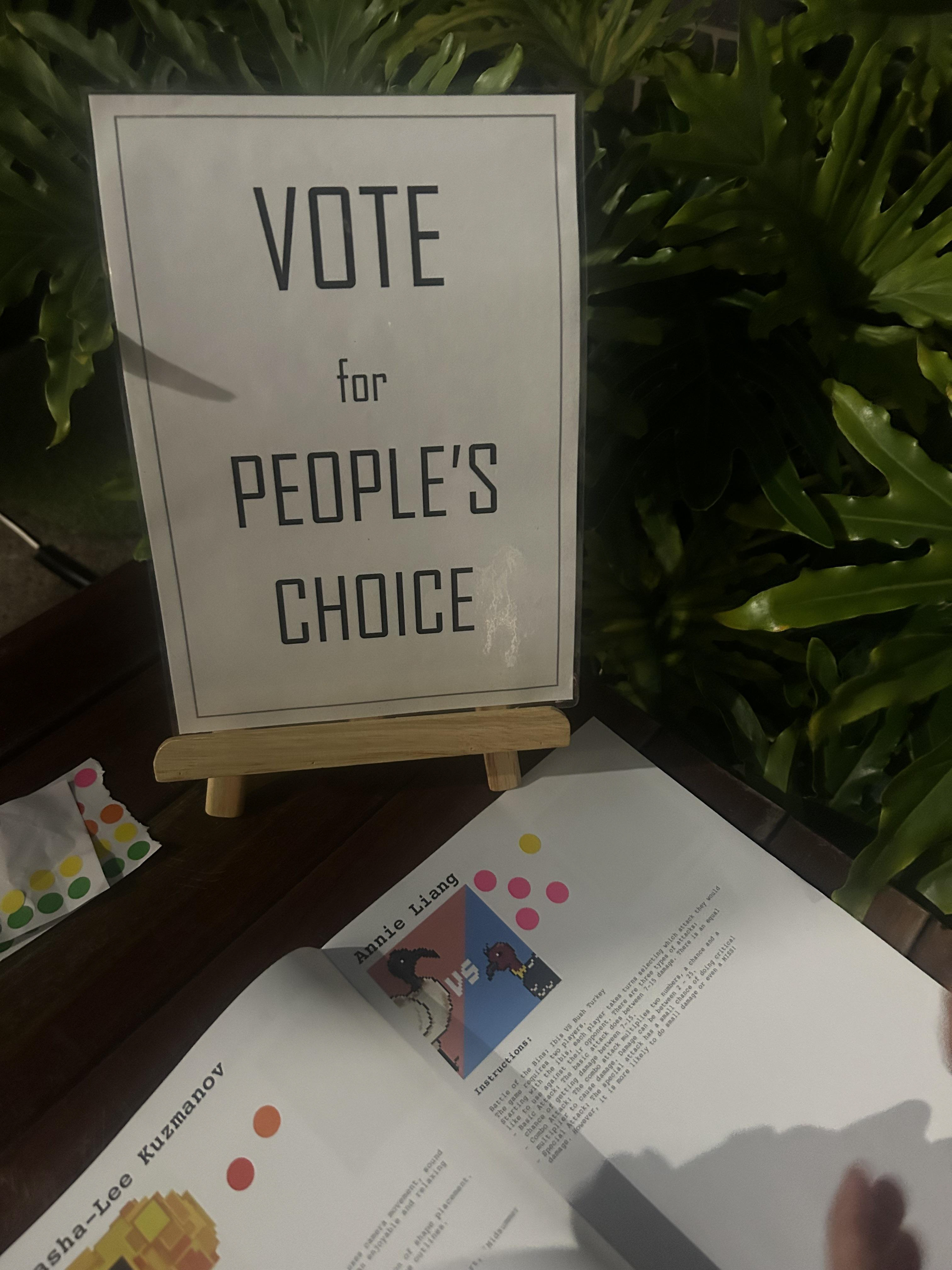
On the 21st of June, the QUT Creative Coding exhibition showcase was held at the Lanes, celebrating the students' work this semester.
Design Documentation
P5js Sketch Introduction
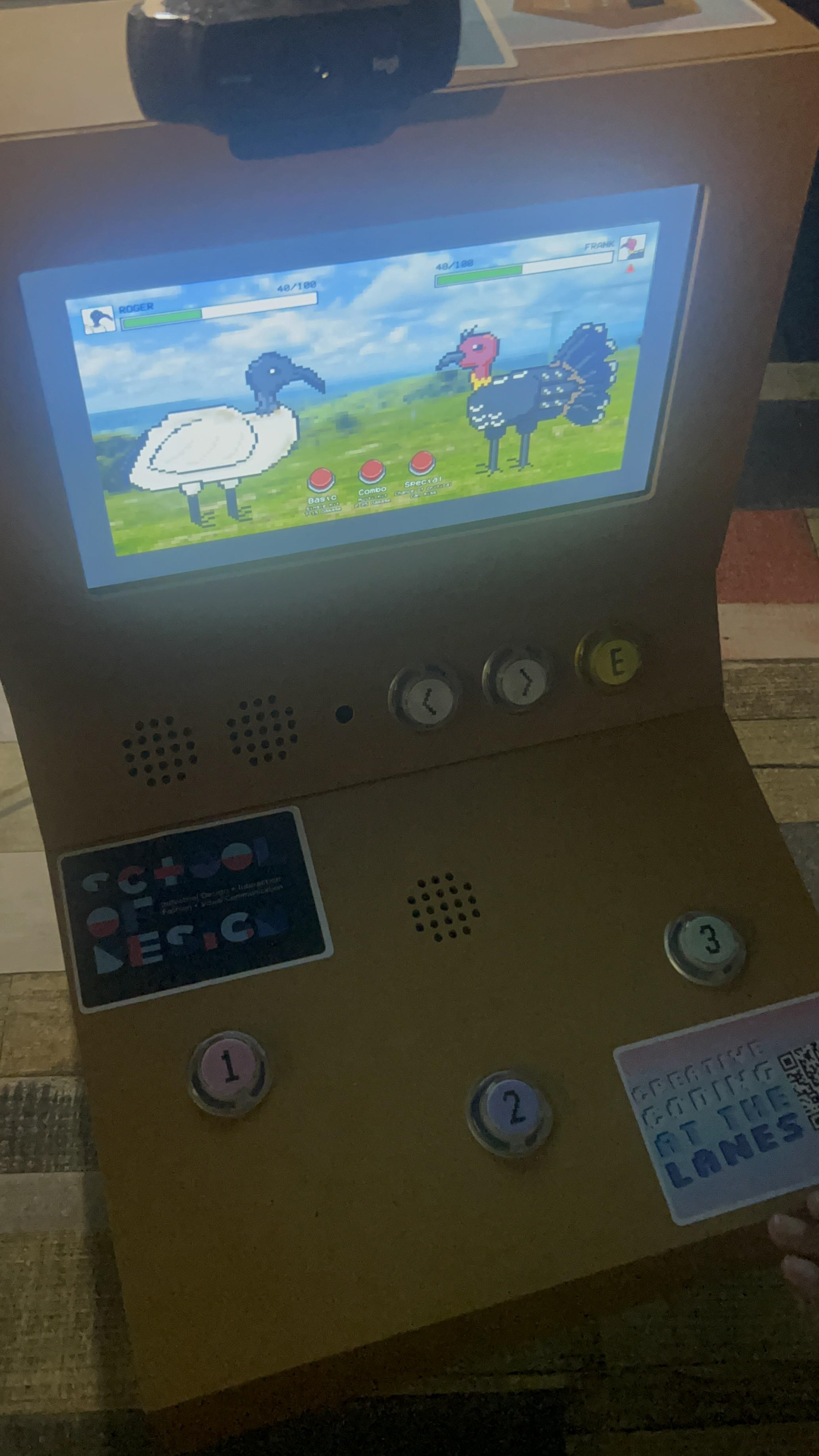
Displayed on the Huey cabinet.
The game requires two players.
Starting with the ibis, each player takes turns selecting which attack they would like to use against their opponent. There are three types of attacks:
Basic Attack: The basic attack does between 7-15 damage. There is an equal chance of getting damage between 7-15.
Combo Attack: The combo attack multiplies two numbers, a chance and a multiplier to cause damage. Damage can be between 2 - 25.
Special Attack: The special attack has a small chance of doing critical damage. However, it is more likely to do small damage or even MISS!
START SCREEN
The start screen explains that users take turns. Players choose when to start the game.
ATTACK PHASE
Players go back-and-forth to attack. Each button corresponds to a different attack style with varying damage outputs.
WIN SCREEN
Once a bird reaches zero health, a win screen declares the winner.
Design and Aesthetic Choices
The aesthetic and design choices were taken from arcade fighting styles. These games have distinct interactions and visual aspects that make up this genre of gaming.
The pixel art style is a prominent art style used within all arcade games, especially fighting games. The overall layout of the sketch shows health UI like turn-based games. Sprite animations, angular shapes and the pixel bit map text aid in fore fronting this art style. All visual aspects, especially character sprites, were drawn in a pixel grid to mimic this style as well. The animation of the birds when attacked also appears jagged, which emulates the frame-by-frame pixel animation style.
The sound effects and music used were 8-bit to simulate the pixelated, retro style.
I chose this interaction style because I wanted to have a game where multiple people can play together. The cult followings of said games have only grown overtime and I wanted to capture this with a competitive game. The simplicity of the three buttons spawn from the how most fighting games require complex combos and experience to effectively play. This game in contrast is beginner friendly, better suited for the exhibition.
Approach to the Design Process
The initial idea to satisfy the brief was to create a turn-based fighting game that allows for two or more player to interact with simultaneously. The cabinet chosen is the one with the three buttons, as the mechanics for the game should be simple to understand.
The chosen fighters are an ibis and a bush turkey. I chose these birds as they are relatively the same size, fit the environment of Australia and my own personal fear of both of them.
The character sprites were drawn in an idle stance. As aforementioned, the pixel art style is reflective of arcade games that is commonly associated with this genre. The idle stance is also how fighting characters look at the beginning of a fight before unleashing combos.
The UI system shows a health bar so the players can identify their status. Though the characters are named, the profile pictures allow for easy identification of which health bar corresponds to who at a quick glance. A value out of 100 also is shown as it will help the players distinguish how much remaining health they have. If it was just the health bar, there could be misinterpretations.
The health bar changes colour when at critical health. This is to immediately let the player know they are in a dangerous state by using colour association.
An end/win screen is the final state of the game. It explicitly lets the users know that the game is over. This abruptly happens once any of the health bars reaches zero.
After a couple of play tests, what needed working on was making the differences between attacks more explicit (without referring to the instructions) and identifying who’s turn it is if the players lose track. The on-screen buttons animate being pressed when one of the keys is pressed, so the players get a visual response that their move was used.
The background image was a personal image I took that was pixelated. This fit the visuals of other fighting games that have detailed, pixel style backgrounds that suit the setting of the fight scene.
To make the impact of the damage more explicit, tint, damage text and a shake animation were all added. This ensures that the players visually understand if damage was taken, how much was taken and the change of state. Sound effects were added at this point, the sound correlating to the amount of damage dealt. Small damaged plays a staccato 8-bit sound in contrast to immense damage playing a downward draining sound.
To show the winner, a death animation plays with the victor wearing a crown. On the start and win screens, the pending action text pulses, simulating the awaiting of instructions.
Thumbnail Sketches
My thumbnail sketch is a VS screen. Typically, in one-on-one fighting games, there are these screens that appear to introduce the characters to the fight.
Creative Influences
Within the design fields of game, interaction and visual communications, there are a multitude of influences that are seen through my game. These influences inspired different aspects such as the mechanics, interaction and visuals respectively.
Pokémon Games – Game mechanics
The obvious similarities include the turn-based combat using animal avatars as the fighters. Two opponents facing off where they take turns selecting attacks amongst a list to do damage. Especially how each attack has different factors that affect the damage. Other aspects I took inspiration was the damage animations.
Street Fighter / Tekken – UI design
The composition of the fighters facing each other with the health bars can also be seen through arcade fighting games such as Street Fighter or Tekken. The thumbnail sketch, the animation of the buttons and visual aspects such as background all took heavy inspiration from these games.
Pixel art style and 8-bit sound effects
The style and sound effects are synonymous to video games. Iconic games such as Mega Man, Super Mario, Legend of Zelda and Metroid debuted in an era where this style dominated the video game market. Currently in the visual communications industry, pixel art is a projected trend of 2024 as it combines minimalistic colours and shading but harbours many details. There also has been a recent resurgence of pixel art and sound in the video game community. Recently ‘demakes’ have become increasingly popular and games such as Undertale, Stardew Valley and Terraria pave the revival of this style.
List of References
floraphonic. (2024a). 8-Bit Game 1. Pixabay. Retrieved May 29, 2024, from https://pixabay.com/sound-effects/8-bit-game-1-186975/
floraphonic. (2024b). 8-Bit Game 2. Pixabay. Retrieved May 29, 2024, from https://pixabay.com/sound-effects/8-bit-game-2-186976/
floraphonic. (2024c). 8-Bit Game 6. Pixabay. Retrieved May 29, 2024, from https://pixabay.com/sound-effects/8-bit-game-6-188105/
XtremeFreddy. (2023). Bit Beats 3. Pixabay. Retrieved May 29, 2024, from https://pixabay.com/music/video-games-bit-beats-3-168873
